
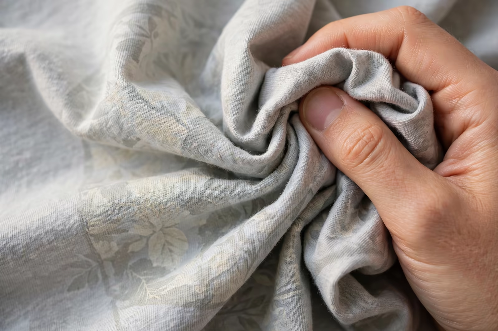
Run your hand across a retail t-shirt print and, on the best garments, you will find almost nothing: the design is in the fabric, not on it. That vanishing hand feel is the signature of water-based printing on light garments, the route fashion brands choose when the print must feel like part of the shirt. It is also a route with honest limits, and knowing both sides of it is what separates a brief that delights from one that disappoints.
Water based printing is run in Bangladesh for brands in Canada, Australia and Europe that want a print with no feel on the fabric.
This guide explains water-based printing as we run it inside our screen printing programs, on garments such as the premium heavyweight t-shirt, for brands building retail ranges where hand feel is a selling point rather than a detail.
What Soft Hand Actually Means
Soft hand is not a mood; it is a measurable property. A soft print flexes with the fabric, lets the weave show through its colours, adds almost no stiffness to the garment, and survives the hand test that every retail buyer performs instinctively: scrunch the shirt, release it, and feel whether the print area behaves like the rest of the garment. Water-based inks achieve it because their pigment rides into the fibres on water, and when the water leaves in the dryer, mostly colour remains.
Plastisol, the industry’s default, sits on the surface as a film, which is why it can be brilliantly opaque and also why the hand finds it instantly. Neither ink is better in the abstract. They are different instruments, and the soft-hand brief is the one where water-based is not a preference but the correct tool, provided the garment and the design meet its conditions.
Why Light Garments Are Its Natural Home
Water-based ink has no body of its own to hide the fabric beneath it, so the garment colour becomes part of the print. On white and light garments this is a gift: colours print true, bright and clean, with the fabric doing none of the fighting it does under an underbase. The lighter the ground, the more the ink behaves like a dye, and the softer and brighter the result becomes in the same stroke.
On dark garments the same transparency turns against the design, because the colour must fight the ground showing through it. Special high-opacity water-based systems exist for dark grounds, and skilled printers make them work, but each step toward opacity on a dark garment spends a little of the softness that justified the route. The honest map is simple: light garments are where water-based printing is at its best, and this guide treats it there.
How the Print Is Built: In the Fibre, Not On It
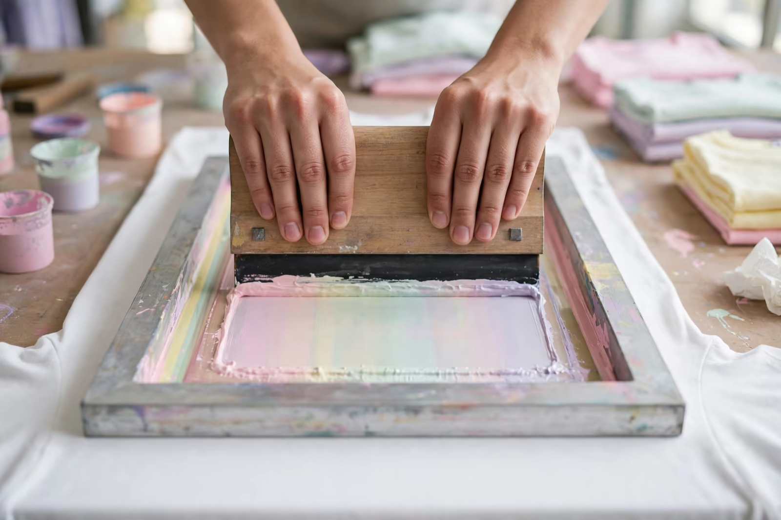
A water-based print is driven down into the fabric rather than laid across it, which changes the printing itself. The ink is thinner, the squeegee work pushes it through the mesh and into the weave, and the printed area is then dried thoroughly, because water trapped in the fabric is the enemy of both cure and colour. Printers judge a good water-based pass by what the back of the fabric shows: even strike-through, colour seated in the cloth, not pooled on its face.
The screens work harder in this system. Water-based inks begin drying in the mesh from the moment printing pauses, clogging fine detail if the room, the ink and the pace are not managed together. Experienced hands keep the screens flooded between prints, work in rhythms the ink tolerates, and clean on schedule rather than on failure. The softness the customer feels in the shop is built out of this unglamorous discipline at the table.
Colour on Light Grounds: Bright, Clean and Honest
Because the ink is translucent, colour mixing for light garments is closer to watercolour than to paint: shades layer and interact with the ground, whites are the fabric itself where the design leaves it bare, and the palette reads fresh in a way surface inks rarely match. Designers who understand this draw for it, letting garments supply the highlights and using the ink for tone, which is why so much vintage and fashion printing has this look: it was designed with the fabric as a colour.
The same transparency sets the expectation for exactness. A brand colour specified as an opaque swatch will sit differently in a translucent ink on a coloured ground, shifting with every garment shade in the range. The strike-off on the production fabric is the only honest reference, and colours are approved there, in daylight, on the garment the customer will buy, not from a drawdown on white card.
Vintage and Distressed Work: Where Water-Based Wins Outright
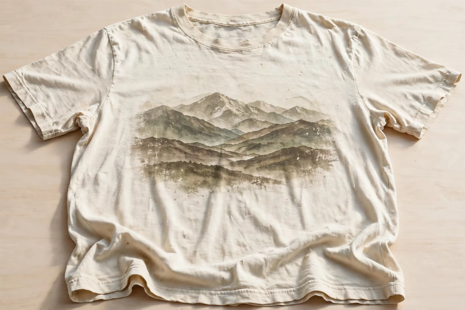
A print that must look ten years old on its first morning is a water-based specialty. Because the colour lives in the fibres, the print fades, softens and cracks, or rather refuses to crack, exactly the way the fabric does, aging with the garment instead of peeling away from it. Distressed artwork printed in plastisol often betrays itself at the first wash, its film breaking in modern, mechanical patterns; the water-based version simply becomes a softer version of itself.
This is why vintage programs specify the ink before they specify anything else. The artwork is drawn with its fading already imagined, colours chosen a shade stronger than the target so the first wash lands them where the designer wanted, and the garment wash, where the program uses one, treats print and fabric as the single cloth they have become. Age, manufactured honestly, starts with an ink that knows how to grow old.
Curing: Driving the Water Out, Completely
Every drop of water in the print must leave before the ink can cure, which makes drying the technical heart of the process. Airflow matters as much as temperature: a dryer that cannot move moist air away from the garments will leave prints that feel dry and fail in the wash, the binder never fully set. Production discipline therefore treats water-based curing as a verified step, with wash tests on production pieces, not a dial setting inherited from the plastisol program running yesterday.
The pace consequences are real. Water-based runs can move more slowly through the dryer than plastisol runs, and humid days ask more of the equipment than dry ones. A factory quoting water-based work has priced this time into the program, or has quietly planned to under-cure your order; the wash test on the strike-off, repeated on bulk pieces, is how a buyer tells the difference before the cartons close.
Hand Feel Versus Opacity: Choosing Per Design
Most ranges are not purist. A brand may print its photographic fashion pieces in water-based for the hand, its bold logo work in plastisol for the punch, and mix the two across a season without a customer ever noticing the seam. The choice belongs to the design and the ground: soft and integrated where the garment is light and the art is tonal; bold and surface-strong where the design is flat colour that must shout across a shop floor.
Hybrid prints exist inside single designs too, a soft water-based body with one element given surface emphasis. What matters is that the choice is made deliberately, per design, with the strike-off judged by hand as much as by eye. The question to ask any factory is not which ink they prefer, but which ink they recommend for this artwork on this garment, and why; the answer tells you whether you are buying judgement or habit.
Fabrics That Reward Water-Based Printing
Natural fibres and their blends are the welcoming grounds: cotton drinks the ink evenly, cotton-rich blends print nearly as kindly, and lighter fabric colours across the range keep the palette honest. Very textured or heavily slubbed fabrics print with character, the ink following the cloth’s irregularities, which vintage programs prize and corporate programs should sample twice. Synthetic grounds are the cautious case, since dye behaviour and ink adhesion vary, and a soft-hand brief on polyester belongs in a conversation about routes, not an assumption.
Fabric weight plays its part quietly. A fine, light jersey shows water-based printing at its most elegant, the print and the cloth nearly indistinguishable; heavier grounds carry it well too, provided the deposit is worked in rather than merely laid on. In all cases the production fabric is the test bed: ink behaviour is a property of the pairing, not of the ink alone, and approvals happen on the pairing or they do not happen at all.
Judging the Strike-Off by Hand, Not by Eye
A water-based strike-off can photograph beautifully and still fail the only test that matters, so the approval ritual is physical. Scrunch the printed area in the fist and release it: the print should spring back with the cloth, without a papery crackle. Rub the print firmly with a dry thumb, then with a damp one: no colour should lift. Stretch the fabric across the design and look for the weave opening evenly through the colour, the sign that pigment is seated in the fibres rather than bridged across them.
Then wash it, once, exactly as the care label directs, and repeat every test. The piece that passes twice is the standard the bulk is held to, and it should be kept, labelled, at both ends of the order. A factory comfortable with this ritual will suggest half of it before you do; a factory that wants approval from a photograph is telling you how the bulk will be judged too, by nobody, from a distance.
Specifying a Soft-Hand Program
A soft-hand specification says so in words: water-based inks, light garment grounds named by colour, artwork supplied with the fabric counted as a colour, and approval by a worn and washed strike-off judged by hand. Quantities follow our standard minimum of 1,200 pieces per style in up to two colours, with the print program costed on the garment and the design together, including the slower cure the route honestly requires.
Send a reference garment if the brand owns one whose hand it loves; feel is the hardest property to describe and the easiest to hand over. And build the wash test into the approval, one garment washed as the customer will wash it, then felt again beside an unwashed piece. Soft hand is a promise made to a hand, and it should be approved by one, before a thousand garments carry it into the world.
Frequently Asked Questions
What makes a water-based print feel softer than plastisol?
Water-based ink carries its pigment into the fabric fibres on water, and once the water is dried out, mostly colour remains seated in the cloth, so the print flexes and scrunches with the garment. Plastisol cures as a film on the surface, which the hand detects immediately however thin it is printed.
Can water-based printing work on dark garments?
High-opacity water-based systems can print on dark grounds in skilled hands, but each step toward opacity spends some of the softness that justifies the route, and an underbase may be needed. Light garments are where the process is at its best, and dark-ground briefs deserve a strike-off before any commitment.
Does a soft-hand print last as long as a standard print?
A properly cured water-based print wears with the fabric and ages gracefully, fading softly rather than cracking or peeling, which is why vintage programs choose it. Its life depends on complete drying at production, verified by wash tests, because under-cured water-based ink is the main cause of early failure.
Why does the colour look different from my swatch?
Because the ink is translucent, the garment colour becomes part of the printed colour, so the same ink reads differently on white, pastel and mid-tone grounds. Approve colour from a strike-off on the production fabric in daylight, never from a drawdown on card, and expect each ground in a range to need its own judgement.