
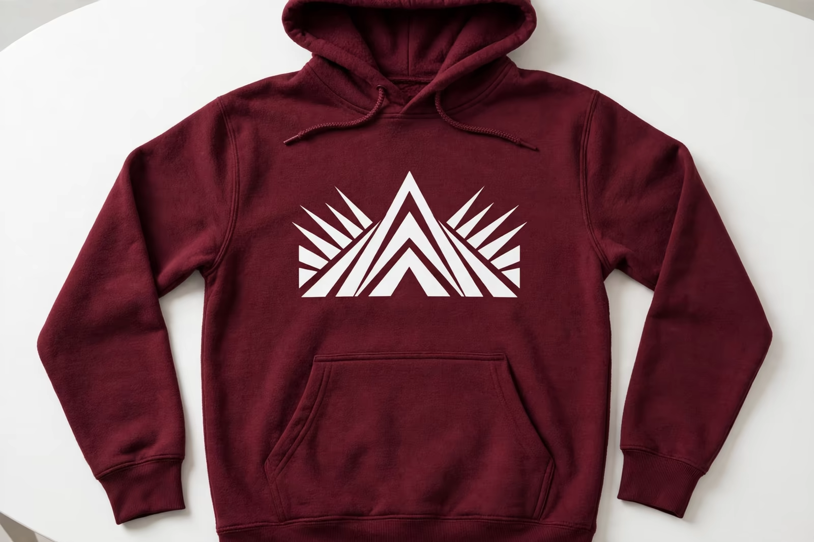
A hoodie is a hostile surface for a screen print. The fabric is thick and lofty, a kangaroo pocket crosses the exact centre of the chest print zone, seams and drawcords interrupt the print area, and the garment will not lie as flat or as still as a t-shirt no matter how carefully it is loaded. Printing fleece well is a discipline of its own, and buyers who understand its problems specify better and approve faster.
Hoodie fleece printing is proven in Bangladesh for buyers in the USA, Germany and the UK on the actual garment before bulk.
This guide explains how hoodie printing works inside our screen printing programs and services, on garments such as the pullover hoodie, from artwork placement over pockets to the registration systems that keep a multi-colour design true on a moving, breathing fabric.
Why Fleece Fights the Print
Fleece is built to be soft, and soft means movement. The face of the fabric compresses under the squeegee and springs back after it, the pile lifts into the ink, and the garment itself is heavy enough to shift on the board if the adhesive hold is weak. A print that registers perfectly on a t-shirt sample can drift a millimetre on fleece, and a millimetre is the width of the line your design trusted.
The ink behaves differently too. A lofty surface drinks ink into its texture, so prints can look starved or rough unless the deposit, the mesh and the stroke are chosen for fleece rather than borrowed from the t-shirt program running beside it. It makes fleece a ground that has to be printed as itself, with settings and artwork that respect its nature.
The Kangaroo Pocket Problem
The pocket is the famous obstacle. Its top edge, its slanted openings and its double-thickness seams all cross the lower chest, exactly where a centred design wants to land, and a print that crosses the pocket opening will crack along the seam, misregister over the ridge and read as an error even when the printing was perfect. The pocket also traps the design’s lowest elements against a surface that moves independently of the garment body when worn.
The professional answers are placement and design shape. Most chest designs are sized and positioned to end above the pocket line, which is why hoodie artwork is drawn to a different template from t-shirt artwork for the same brand. Where a design deliberately crosses the pocket, it is drawn for the crossing: bold shapes, tolerance at the seam, and a strike-off worn and flexed before anyone approves it, because a pocket print is judged in motion, not on the table.
Seams, Drawcords and Hardware in the Print Zone
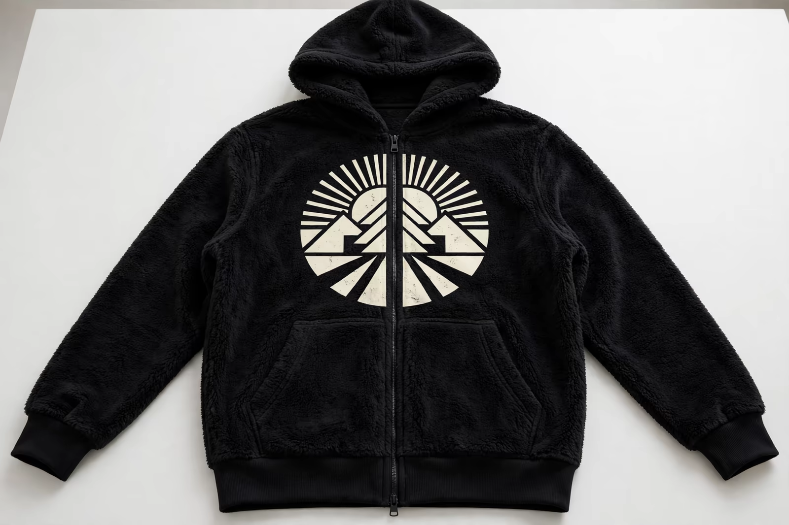
The pocket is not the only interruption. The hood’s double layer and drawcord sit above the chest print, shoulder seams run under sleeve prints, the ribbed hem lifts the garment’s lower edge, and zipped hoodies split the entire canvas down the middle with a metal zip that no screen may print across. Each feature removes part of the print map, and the artwork that ignores them gets drawn once and paid for twice.
A zip hoodie design is really two designs, left and right, separated by the zip and expected to meet in the customer’s eye when the garment is worn closed. That meeting depends on loading accuracy garment after garment, and on artwork that forgives the small meeting errors human loading produces: a design whose two halves must touch at a point will betray every piece; a design with a planned gap at the zip betrays none of them.
Registration on a Surface That Moves
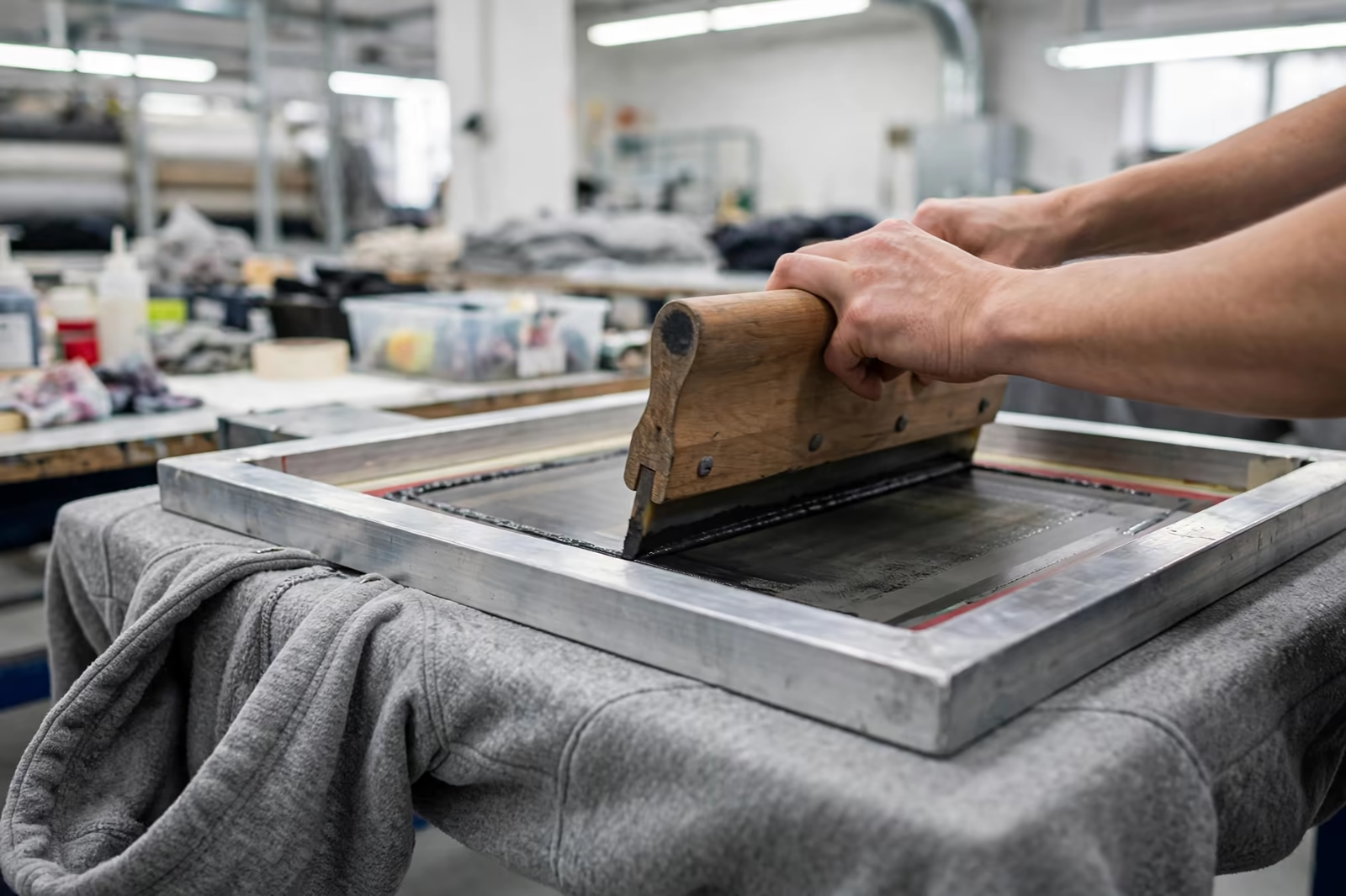
Multi-colour registration on fleece is a fight against three movements: the fabric compressing and recovering under each pass, the heavy garment shifting between stations, and the print surface changing height wherever a seam or the pocket edge passes under the screen. Printers who run fleece daily counter with stronger board adhesive, screens set for the garment’s true thickness, and print sequences that lay the most movement-sensitive colours while the garment is freshest on the board.
Artwork can help more than machinery. Traps and overlaps sized generously for fleece, fine reversed lines avoided, and halftone detail kept bold all widen the margin inside which a good printer stays perfect. The buyer’s part is to let the factory’s separator adapt the design for the garment, and to judge the strike-off as a hoodie: worn, zipped, pocket in use, rather than flat and forgiving under sample-room light.
Ink Deposit and the Rough Print Problem
The classic fleece defect is the rough, matte print that feels like sandpaper and cracks when the fabric stretches. It comes from ink sitting on top of the pile instead of bedding into it: too little deposit, the wrong mesh, or a single fast pass where the fabric needed the ink worked in. The cure is craft, a deposit built for texture, often with a first pass that flattens the pile and a second that delivers the colour, cured fully because thick deposits on thick fabric hide uncured centres.
Hand feel is a design choice here too. Some brands want the bold, slightly raised print fleece carries well; others want the softest possible result and choose discharge or water-based routes on suitable fleece, trading a little vibrancy for a print the hand cannot find. Either is right when it is chosen; what fails is expecting t-shirt physics from a fabric that announced its difference in its name.
Hood Prints, Sleeve Prints and Awkward Placements
Hoodies invite placements t-shirts cannot offer: the hood itself, printed outside or inside, the sleeve running to the cuff, the lower back above the hem. Each has its own loading jig and its own honesty about what will survive. A hood print crosses seams and curves in wear; a sleeve print on a fleece arm is a narrow, shifting canvas; both reward bold, simple artwork and punish fine detail that a flat chest would have carried easily.
Sampling is where these placements are proven. The strike-off must be printed on the production garment, not a substitute, because the jig, the seam positions and the fabric behaviour are the placement. Buyers approving a hood or sleeve print from a flat artwork proof are approving a drawing; approving it from a worn production sample is approving the product their customers will actually receive.
Left-Chest Versus Full-Chest on Hoodies
The small left-chest print is fleece’s forgiving placement: it sits above the pocket, clear of seams, on the flattest ground the garment offers, and it prints with t-shirt manners. It suits corporate and team programs where the brand mark matters more than the statement, and it carries fine detail and small text better than any other hoodie position. A large share of professional hoodie orders lives here for those reasons.
The full-chest statement print is the fashion choice, and it is where all the fleece disciplines gather: placement against the pocket, deposit against the pile, registration against the movement. It costs more to sample and a little more to run, and it produces the garment that sells. The honest guidance is not to avoid it but to resource it: artwork drawn for the garment, a worn strike-off, and a separator who has seen the design on fleece before the bulk has.
Specifying a Hoodie Print Program
A complete hoodie specification names the garment style, including pocket and zip details, gives artwork drawn to a hoodie template with the pocket line marked, states the placement measured from a fixed point such as the neck seam, and confirms ink expectations for hand feel and stretch. Quantities follow our standard minimum of 1,200 pieces per style in up to two colours, with the print program costed from the artwork and the garment together.
Send a physical sample of the exact hoodie when the program is new, or trust the factory’s garment and sample on it from the first piece. Fleece varies more between mills than t-shirt jersey does, in weight, pile and stretch, and a print perfected on one mill’s hoodie can misbehave on another’s. The programs that run cleanly year after year fixed the garment and the print as one specification, and changed them only together.
Flashing and Curing a Thick, Insulating Garment
Fleece insulates, which is its purpose on the body and its complication at the dryer. The surface of a thick print can reach curing temperature while the ink nearest the fabric, wrapped in an insulating layer of loft, lags behind it, so a print that passes a surface check can carry an under-cured heart that washes out or cracks early. Print rooms running fleece allow for the garment’s thermal mass: dwell times and temperatures set for the thickest print on the thickest garment in the program, verified by wash and stretch testing rather than by the dryer’s dial.
Flashing between colours carries the same discipline. Too little flash and the next colour drags; too much and the fleece surface scorches or the print builds a hard plate the wearer feels with every move. The window is narrower than on jersey, and it moves with fabric weight, which is one more reason a hoodie program is sampled on its own garment and its settings recorded, so the second season starts from knowledge instead of nostalgia.
Stretch, Wear and How Long a Fleece Print Lasts
A hoodie is pulled over heads, stuffed into bags and washed hard, and its print is stretched across the chest every time it is worn. Print longevity on fleece therefore depends on elasticity as much as adhesion: inks and deposits chosen to flex with the fabric, cured fully so the film is strong, and kept out of the garment’s hardest-working zones where the design allows it. The pocket edges and the zip line are where tired prints confess first, because those are the places the fabric bends daily.
Buyers can test all of this on the strike-off in five minutes: stretch the print by hand, flex it over the pocket seam, wash it once and stretch it again. A print that survives the sample room’s abuse will survive the customer’s wardrobe; one that cracks on the table was never going to improve in a carton. Longevity is not a promise a factory makes in a quote. It is a property the sample demonstrates before the bulk exists.
Frequently Asked Questions
Can a design be printed across the kangaroo pocket?
It can, with artwork drawn for the crossing: bold shapes, tolerance where the design meets the pocket seam, and a strike-off that is worn and flexed before approval. Most programs instead size the chest design to finish above the pocket line, which is why hoodie artwork uses a different template from the same brand’s t-shirt artwork.
Why does the print on my hoodie feel rough and crack?
That is ink sitting on top of the fleece pile instead of bedding into it, from too little deposit, the wrong mesh or a single fast pass, sometimes with an under-cured centre in a thick deposit. Fleece needs its own deposit build, often a pile-flattening first pass, and craft settings chosen for texture rather than borrowed from a t-shirt run.
Can both halves of a zip hoodie design line up exactly?
They can meet closely with careful loading, but artwork that demands a point-perfect join across the zip will show small errors on real garments. Good zip hoodie designs plan a small gap or overlap at the zip so the meeting looks intentional on every piece, and the strike-off is approved worn and zipped, not flat.
Is a left-chest print easier on a hoodie than a full-chest print?
Yes. The left chest sits above the pocket on the flattest, stillest ground the garment offers, clear of seams, and it holds fine detail well. Full-chest prints can look superb but need pocket-aware placement, fleece deposit craft and registration margins, so they deserve a worn strike-off and a little more sampling budget.