
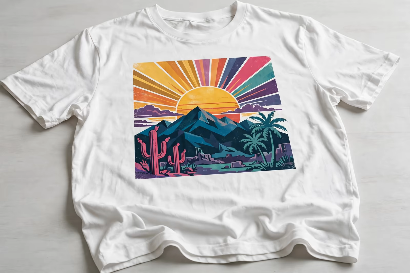
Every colour in a screen print design is a screen, a setup, a print pass and a pair of hands, which is why the same t-shirt can cost noticeably more with six colours than with two, and why the colour count question arrives in almost every first enquiry we receive. The honest answer is not “fewer is cheaper” and stop there; it is understanding what each colour actually buys, and where a design can lose a colour without losing itself.
Colour counts are quoted honestly in Bangladesh for buyers in the UK, France and Australia, so a design is priced by the screens it truly needs.
This guide explains the real cost drivers behind colour count inside our screen printing programs, how buyers weigh them against their payment terms and budgets, and how to send a design through get a quote in a form that prices accurately the first time.
What One More Colour Actually Adds
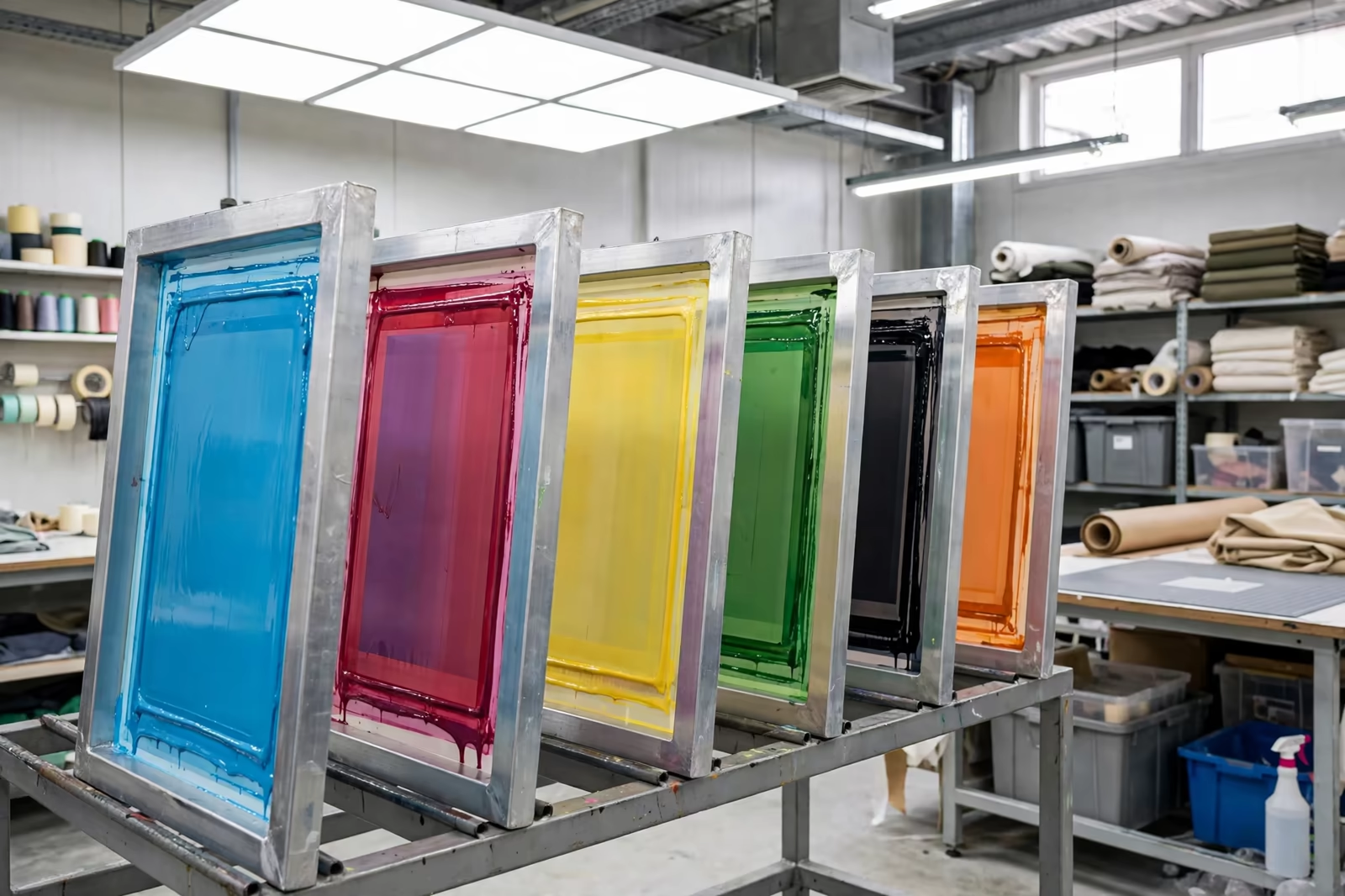
A colour is never just ink. Each colour in the design needs its own screen made, coated, exposed and washed; its own setup on the table or press with registration checked; its own pass across every garment; and its own moment in the flash or cure sequence when the method demands it. Ink is the smallest line in that list. Labour, screens and press time are the real cost, and they multiply by the colour count on every single piece.
This is why colour cost behaves like a staircase rather than a slope. Moving from one colour to two adds a whole second screen-and-pass cycle, not a small percentage, and moving to six multiplies the setup work again. Buyers who understand the staircase stop asking why a photographic design prices differently from a one-colour logo, and start asking the better question: which colours in this design are earning their place.
Screens, Setups and the Fixed Cost Nobody Sees
Most of a colour’s cost is fixed at the front of the job: the screen itself, the film, the exposure, the setup and the strike-off approval. That fixed cost is the same whether the run is short or long, which is why colour count hurts small orders far more than large ones. Spread over a long run, six screens become a modest per-piece figure; carried by a short run, the same six screens can be the difference between a viable program and an impossible one.
The practical consequence is that colour reduction advice changes with volume. On a long program, keep the colours the design needs and let volume carry them; the per-piece difference between four and five colours may be small enough to ignore. On a short program, every colour is a serious budget decision, and the design conversation should happen before the quote, not after it.
The Underbase: The Colour That Is Not in Your Design
Dark garments add a hidden colour to almost every job: the underbase, a white or barrier layer printed first so the design colours sit bright on top of it. Your artwork may show four colours; the press prints five. Buyers comparing quotes across factories sometimes meet this as a surprise line, and occasionally discover a cheaper quote simply left the underbase out, with the dull print arriving as the explanation.
Count the underbase whenever you cost a dark-garment design, and ask any factory quoting without one how the colours will hold their brightness. On polyester grounds the barrier version of that underbase may also be doing dye migration duty, another reason it is not the line to negotiate away. The invisible colour is frequently the one doing the most work in the print.
When a Colour Earns Its Place
Some colours carry the design: the brand colour that must match, the skin tone in a portrait, the highlight that gives a print its depth. Others are passengers: a near-duplicate shade the eye cannot separate at garment distance, a shadow colour a halftone of the darker neighbour would render, a fifth colour added because the artwork file happened to contain it. Separators earn their fee in this judgement, rebuilding designs so the surviving colours do double work.
A useful test is to view the design at the size and distance the garment will be seen. Colours that merge at three metres can merge at the desk, into one screen printing both tones as halftone and solid. Colours that still read as separate and necessary at that distance stay. Most designs that arrive with eight colours and leave with five lose nothing a customer would pay for, and the saving funds the parts of the program buyers actually notice.
Halftones: More Shades Without More Screens
The cheapest colour in screen printing is the one a halftone fakes. A single ink printed in dots of varying size gives the eye a whole scale of shades, so a design needing light, mid and dark versions of one colour may need exactly one screen, not three. Vintage and single-colour photographic work lives entirely on this economy, and spot designs use it quietly wherever a tint of an existing colour appears.
Ask for this explicitly when a design carries tints. Artwork files list every tint as a colour; a separator reading the design as print rather than as file will collapse the tints into their parent ink and say so in the quote. The saving is real, and it costs the design nothing, because the shades were always going to print as dots on fabric whatever the file called them.
Special Inks and Effects: Priced as What They Are
Metallic, puff, discharge, high-density and glow effects are colours in the count and extras in the process: special inks cost more than standard ones, some need their own cure or handling, and most slow the run a little. None of that makes them bad value; a puff highlight or a metallic brand mark can be the entire point of a design. It does mean they should be chosen as features, priced openly, rather than arriving as surprises inside a colour count nobody itemised.
Discharge deserves its own note because it can reduce cost elsewhere: on suitable dark cotton it replaces the underbase entirely, printing soft colour directly into the fabric, so a design can drop a screen while gaining hand feel. The route depends on the fabric and the colours, which is why effect choices belong in the artwork conversation, with the separator, before the quote fixes them.
Registration, Waste and the Hidden Cost of Tight Designs
Colour count is not the only design-side cost. Designs whose colours must align to hairline precision, butt-registered with no overlap allowance, print slower and waste more: every misregistered piece is a garment lost, and the waste rate is a real cost someone pays, either visibly in the quote or invisibly in a factory quietly lowering its care. Experienced designers build traps and overlaps into multi-colour work so the press can run at honest speed with honest waste.
Buyers cannot see this cost in their artwork, which is precisely why the factory should name it when it appears. A design that needs press time doubled for registration care is a design choice with a price, and a good quote says so in plain words rather than hiding it inside a per-piece figure that then looks uncompetitive against a factory that never read the artwork closely.
How Volume Changes the Colour Conversation
Colour cost per garment falls as volume rises, because the fixed screen and setup costs spread thinner while the per-pass labour stays constant. This produces the trade’s familiar pattern: the same design priced keenly at long volume and steeply at short volume, with the difference concentrated in the colours. Buyers planning a design across several order sizes should ask for the colour cost shown separately at each size, so the design decision and the volume decision stay visible as two decisions.
Our programs run at our standard minimum of 1,200 pieces per style in up to two colours, and colour counts above that are quoted per design from the artwork itself. Repeats change the picture again: screens are stored or remade cheaply, setups are known, and the second run of a six-colour design costs meaningfully less than its first, a fact worth remembering before cutting a colour the brand will want back next season.
Asking for a Quote That Prices Colours Honestly
Send the artwork as it will print, at size, with the garment colours named, and ask for the quote to show the colour build it assumes: how many screens, whether an underbase is counted, which effects are included, and what the design would cost with one colour fewer. That last question is the most useful sentence in print buying, because it turns colour count from an argument into a priced option the buyer can weigh against the design in front of them.
A factory that answers it precisely has read the artwork, thought like a separator, and quoted the job rather than a guess. A factory that cannot say what a colour costs has not costed the job at all, and the difference will arrive later, in the print, in the invoice, or in the quiet omission of the underbase nobody mentioned. Colours are cheap to discuss before screens are made and expensive to discover after.
Colour Matching: When One Colour Works Like Two
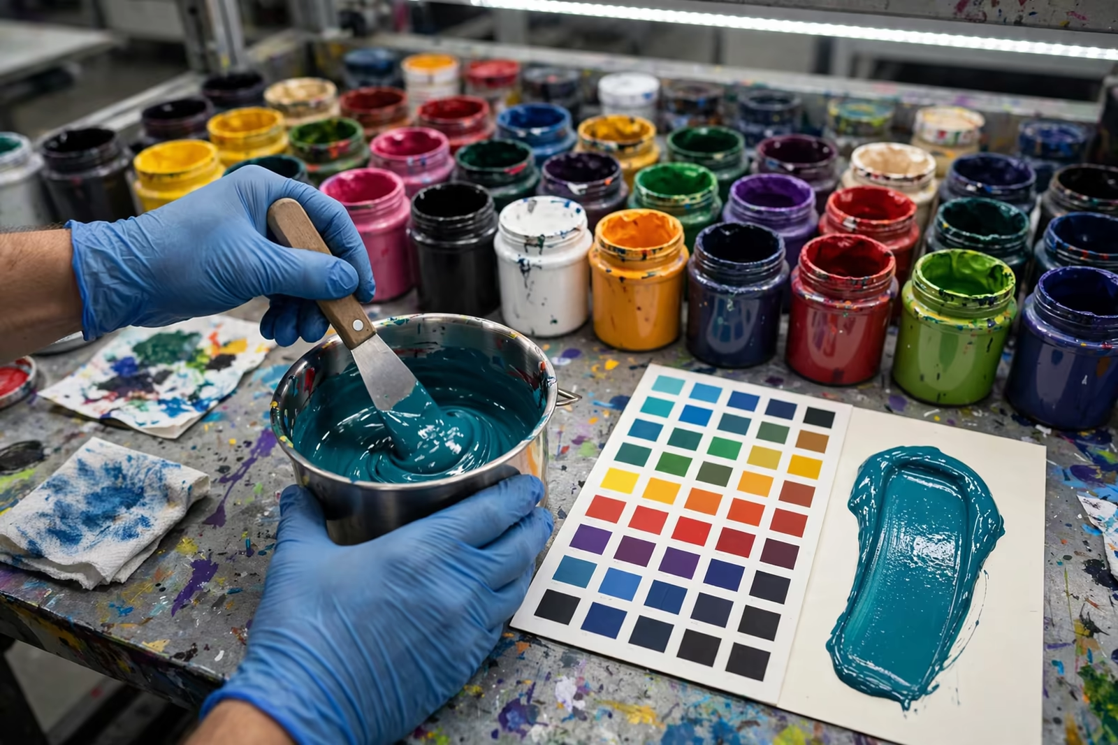
Not all colours cost the same to print even when the screen count is equal. A colour that must match a brand standard exactly, a specific Pantone reference checked under controlled light, takes mixing time, drawdowns and approval rounds that a colour chosen from the ink shelf does not. Fluorescent and very saturated colours can also need a double hit, two passes of the same screen, to reach their strength on the garment, which is one colour doing the work of two in press time.
None of this is an argument against matched colours; brand colour is often the point of the print. It is an argument for naming the standard when you send the artwork, so the quote prices the matching rather than discovering it at the sampling table, where a colour correction round costs days that a sentence in the enquiry would have saved.
Frequently Asked Questions
How much does each extra colour add to a screen print?
Each colour adds a screen, a setup and a print pass on every garment, so the cost is a step, not a small percentage, and the fixed screen part falls hardest on short runs. Send the artwork for an exact figure: the same extra colour prices differently on a long program and a short one.
Is the white underbase counted as a colour?
Yes. On dark garments the underbase is a full screen and pass printed before your design colours, and on polyester it may also be the dye migration barrier. Any quote for dark garments should state whether it is included; one that omits it will usually deliver duller colours as the explanation.
Can a design with many shades be printed with few screens?
Often, yes. Tints of one colour print as halftone dots from a single screen, and a good separator can rebuild a design so fewer inks do more work, merging shades the eye cannot separate at garment distance. Ask what the design costs with one colour fewer and compare the strike-offs.
Why is the same design cheaper per piece on a repeat order?
Because the first run carries the design work: separations made, screens produced, setup learned and approval samples printed. A repeat reuses that work, so its per-piece price drops, especially on multi-colour designs where the front-loaded costs were the largest part of the first quote.