
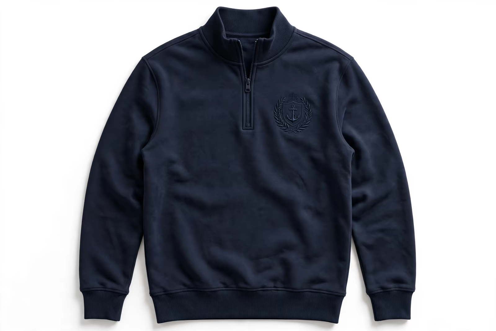
The loudest logo in the room is rarely the most expensive-looking one. Tone-on-tone embroidery, thread matched to the garment’s own colour, builds the brand mark in texture and shadow rather than contrast, and it has become the signature of premium minimal branding: quarter-zips in hotel lobbies, spa and golf apparel, quiet corporate programs where the logo should be discovered, not announced. Sewing a design in its own colour sounds simple. Done properly it is a study in stitch direction, sheen and restraint, and the difference between the premium version and the invisible one is craft.
Produced in Bangladesh for corporate and fashion brands in the UK, Canada and France, tone on tone embroidery is matched thread to garment under the same light the buyer will judge it in.
This guide explains how we build monochrome work inside our embroidery programs, on garments such as the quarter-zip sweatshirt, for labels developed through brands.
What Tone-on-Tone Actually Is
Tone-on-tone means the thread colour family matches the garment, sometimes the exact dye shade, sometimes one deliberate step lighter or darker. The design is read by three signals instead of colour contrast: the raised texture of the stitches, the way thread catches light at angles flat cloth does not, and the shadow the relief throws. At conversational distance a good tone-on-tone mark is unmistakable; in a photograph it can nearly vanish, which is precisely its character and its one commercial risk.
Monochrome, its close relative, uses one thread colour across the whole design, not necessarily matched to the garment: a single navy on white, a single white on black. Both techniques strip the design to its drawing, which is why weak logos suffer in them and strong ones shine. There is nowhere for a muddled shape to hide when colour stops helping it.
Stitch Direction: The Design Tool That Replaces Colour
With contrast gone, direction becomes the palette. Fill stitches laid at different angles reflect light differently, so adjacent areas of the same thread read as different tones purely from their stitch geometry: a shield’s field running one way, its border another, its centre mark a third. Digitizing tone-on-tone work is this choreography, planes of light arranged so the eye separates shapes the dye cannot.
Satin and fill choices heighten the effect. Satin’s smooth columns gleam along their length; fills texture like woven cloth; a design that alternates them builds contrast from finish alone. The digitizer samples angles on the sew-out, in daylight and under indoor light, because the effect is optical and must be proven optically: a drawing that separates beautifully at noon can merge under office lighting, and the program deserves to know before bulk.
Sheen, Matt and the Deliberate Half-Tone
Thread finish is the second dial. A rayon or high-sheen polyester against a matt garment fabric gives the strongest tone-on-tone read, the logo surfacing as a quiet shine when the wearer moves. Matt thread on a sheened technical fabric inverts the trick. The half-step variants, thread one shade darker being the most useful, give a design that reads clearly at distance while keeping the monochrome discipline: technically a contrast, practically a whisper.
Half-tones are also the rescue when a brand wants the minimal look on mid-colour garments, where exact matching fails hardest: mid-grey on mid-grey can disappear entirely in flat light. One step of separation, approved on a worn sample in ordinary rooms, keeps the aesthetic and saves the legibility. Premium minimal is not a purity contest; it is an effect, and the effect is judged where the garment will actually be worn.
Fabric Colour Matching: The Dye Lot Problem
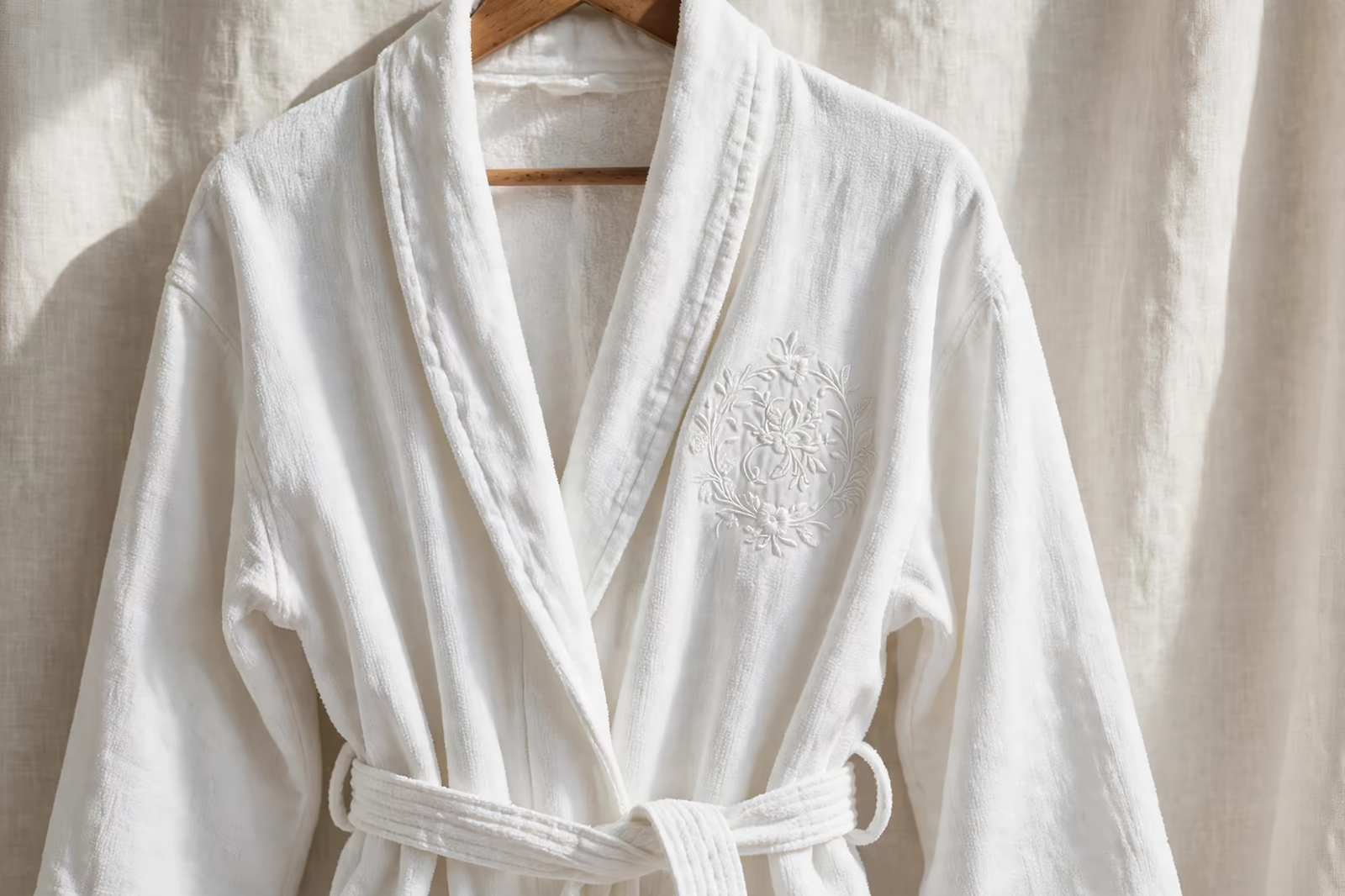
Matching thread to fabric is a physical negotiation. The garment’s colour is a dye lot, varying slightly between batches; the thread is a different material taking light differently, so an exact numeric match is neither possible nor needed. The match is made by eye from the shade card against the production fabric, in daylight, and approved as a sew-out: what matters is that the pair reads as one family on the body, not that any instrument blesses them.
Programs repeat across seasons must record the thread against the fabric family rather than assume the garment colour is constant. When a garment shade is re-dyed or a supplier changes, the tone-on-tone match is re-proven, because drift invisible in contrast work is the whole design here. A slightly-off match does not look slightly off; it looks like a mistake about what colour the garment was supposed to be.
Black on Black and White on White: The Two Extremes
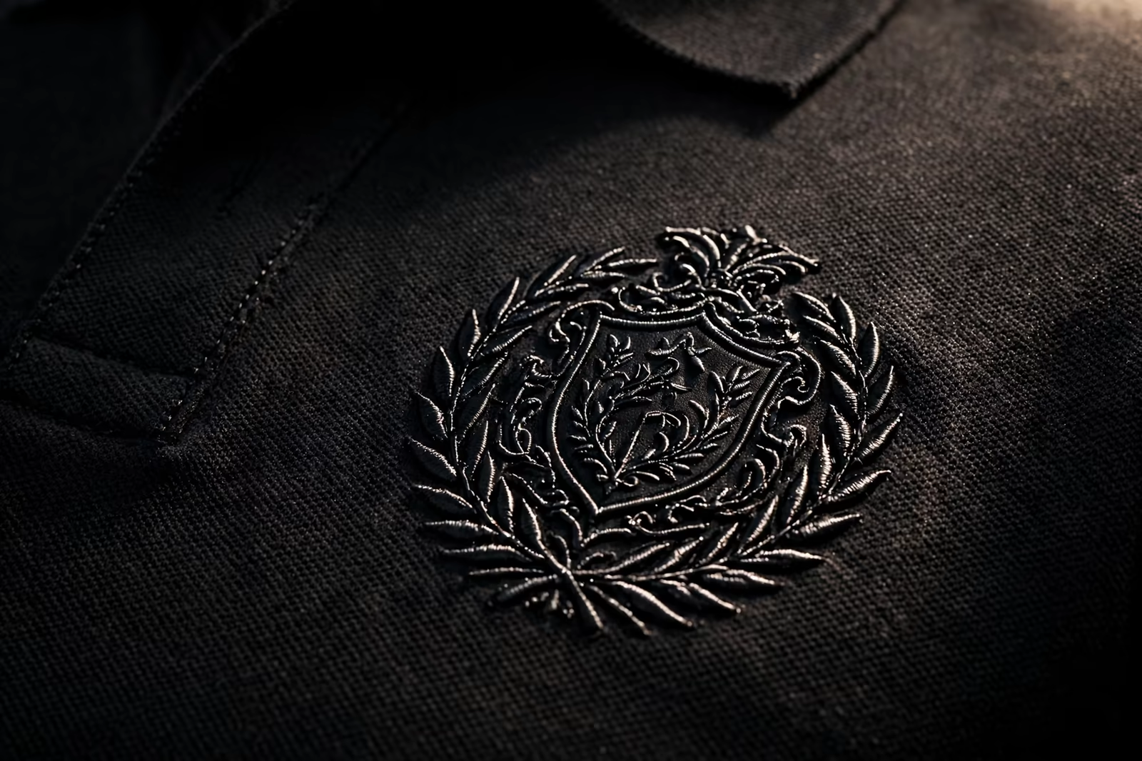
The deepest version of the technique matches dark to dark: black thread on a black garment, where the mark exists almost entirely as relief and moving shine. It is the uniform of high-end security, nightlife and premium hospitality precisely because it signals without shouting, and it is unforgiving in production: density, direction and sheen must all be right, because there is no colour difference to forgive a lazy fill. Judged on the body in real light, a good black-on-black chest mark is unmistakable; judged from a proof photograph, it barely exists, and buyers must be warned not to approve it from pictures.
White on white inverts the challenge: bright thread on bright cloth reads through shadow alone, and texture must do everything. It suits bridal, spa and summer programs where purity is the message, and it punishes any soil or shading inconsistency in either material. Both extremes are legitimate, both are sampled on the body, and both make the same point: at the ends of the tonal range, embroidery stops being printing with thread and becomes sculpture at garment scale.
Where Tone-on-Tone Earns Its Premium
The look belongs where understatement signals confidence: hospitality and wellness uniforms whose guests should feel calm, golf and resort apparel, premium corporate gifts, spa and beauty retail, the quiet end of tech and finance merchandise. In these settings a contrast logo reads as advertising while the tonal mark reads as belonging, part of the garment rather than applied to it, and the perceived value of both garment and brand rises accordingly.
It also solves two practical problems elegantly. Multi-brand environments, a venue’s staff wearing garments that must sit peacefully beside many client logos, calm down in tone-on-tone. And programs photographed constantly, uniforms in marketing imagery, avoid the visual noise of a hard logo competing with every scene. The premium is not snobbery; it is the mark behaving correctly in its environment, which is what all good branding does.
Where It Fails: Visibility Jobs
Some logos have work to do at distance: safety and site staff who must be identified across a yard, event crews in a crowd, delivery and service teams whose brand is their visibility. Tone-on-tone betrays those jobs politely and completely. The same is true for small chest marks in flat indoor light, for designs with fine detail that only contrast was holding together, and for any program whose garments are sold partly on the logo being seen in product photography.
The honest factory conversation sorts garments into visibility work and presence work before the thread is chosen. Many strong programs run both: tonal marks on the customer-facing premium pieces, full contrast on the operational ones, the brand system holding them together by drawing rather than by colour. Consistency of artwork, flexibility of rendering: that is a brand system behaving like one.
Detail in Monochrome: Redrawing for One Colour
Multi-colour logos often use colour to separate overlapping elements; strip the colours and the elements collide. Monochrome versions are therefore redrawn, not merely recoloured: overlaps become outlines or direction changes, internal detail is simplified to shapes that read in relief, and small text is retested against the legibility floor without contrast’s assistance. The redrawn version is its own artwork file, approved as its own sew-out, in the program record beside the full-colour master.
Brands with strong simple marks, a monogram, a crest, an animal, a geometric device, take to monochrome naturally, which is one reason such marks are built that way in the first place. Brands whose identity lives in a colour combination should keep it and let tone-on-tone serve other garments; forcing a colour-born logo into one thread teaches the same lesson as forcing small text below its floor, at fleet scale.
Specifying a Tone-on-Tone Program
The specification names the relationship, exact family match or one step darker, the thread finish against the fabric finish, and the lighting the approval was judged in. Quantities follow our standard minimum of 1,200 pieces per style in up to two colours, and monochrome programs often use their second allowance not at all, which is rather the point. Samples are approved worn, indoors and out, because the effect is light-dependent and the garment will live in both.
Send the production garment or its exact fabric with the artwork: tone-on-tone is a relationship between two specific materials, and it cannot be specified in the abstract. The sew-out that results, a logo you read by shadow and shine, is either the quietest premium mark in your range or a lesson in why some logos need their colours, and either answer, learned at sampling, is worth the round it took to learn it.
Washing, Wear and How Tonal Work Ages
Tone-on-tone ages differently from contrast work, and mostly better. There is no colour relationship to break: contrast embroidery can fade unevenly, thread against cloth, until a once-matched pair looks estranged, while a tonal mark fades as one family and keeps its composure. Its enemies are subtler: shine flattening as thread wears, relief softening on frequently pressed areas, soil collecting in stitch texture on pale garments. All declare themselves slowly and evenly, which wearers read as the garment mellowing rather than failing.
Care guidance protects the effect: washing inside out spares the relief its worst abrasion, and avoiding hard pressing directly on the mark keeps the texture standing. Programs specifying tonal work for rental or hospitality fleets should see a sample through twenty wash cycles, not because the technique is fragile, but because its failure mode is gradual and only a genuinely aged sample shows the garment the customer will be wearing in month six.
Frequently Asked Questions
What is the difference between tone-on-tone and monochrome embroidery?
Tone-on-tone matches the thread to the garment’s own colour family so the design reads by texture, sheen and shadow. Monochrome uses a single thread colour anywhere, matched or contrasted. Both strip the design to its drawing; tone-on-tone is the quieter, premium-minimal member of the family.
Will a tone-on-tone logo be visible enough?
At conversational distance, yes, when it is digitized for the effect: stitch direction and thread sheen create the separation colour would have given, and a one-step-darker thread rescues mid-colour garments. It will read weakly in flat photographs and at long distance, which is why visibility-critical uniforms should keep contrast work.
Can any logo be sewn tone-on-tone?
Strong, simple marks take to it naturally. Logos that rely on colour to separate overlapping elements must be redrawn for one colour first, with overlaps becoming outlines or direction changes, and the redrawn version approved as its own sew-out. Colour-born identities are usually better kept in colour.
How is the thread matched to the garment colour?
By eye, from the shade card against the production fabric in daylight, and approved as a sewn sample, because thread and cloth take light differently and dye lots drift. The record is kept per fabric family and re-proven when a garment shade changes, since in tone-on-tone work the match is the design.