
A photograph holds millions of colours; a screen holds one ink at a time. Bridging that gap is the work of halftones and simulated process printing, the techniques that let a portrait, a landscape or a shaded illustration live on a t-shirt with its light and depth intact. Buyers who understand the bridge commission better artwork, approve samples faster and stop expecting the press to perform the one trick it cannot: printing a photograph directly.
Simulated process separations are proofed in Bangladesh for buyers in the USA, the UK and Australia before the full run is printed.
This guide explains both techniques inside our screen printing programs, on garments such as the oversized streetwear t-shirt, and it ends with the artwork and approval steps that make a quote for photographic work accurate.
Why Photographs Cannot Print Like Photographs
Paper printing mixes four transparent inks on a white sheet at microscopic dot sizes, thousands of dots blending in the eye into continuous tone. Garment printing works under harsher physics: inks are largely opaque, screens are woven mesh with a countable thread grid, and the ground is coloured, textured fabric that moves, stretches and absorbs. A process that assumes a smooth white page fails politely on a black hoodie.
So the factory does not print the photograph; it translates it. The image is rebuilt as a set of dot patterns and colour layers that the eye, standing at normal viewing distance, reassembles into the picture. Every photographic garment print you have ever admired is this illusion executed well, and the quality of the translation, done at the separation desk, decides whether the garment looks like the photo or like a rumour of it.
Halftones: One Ink, a Thousand Apparent Shades
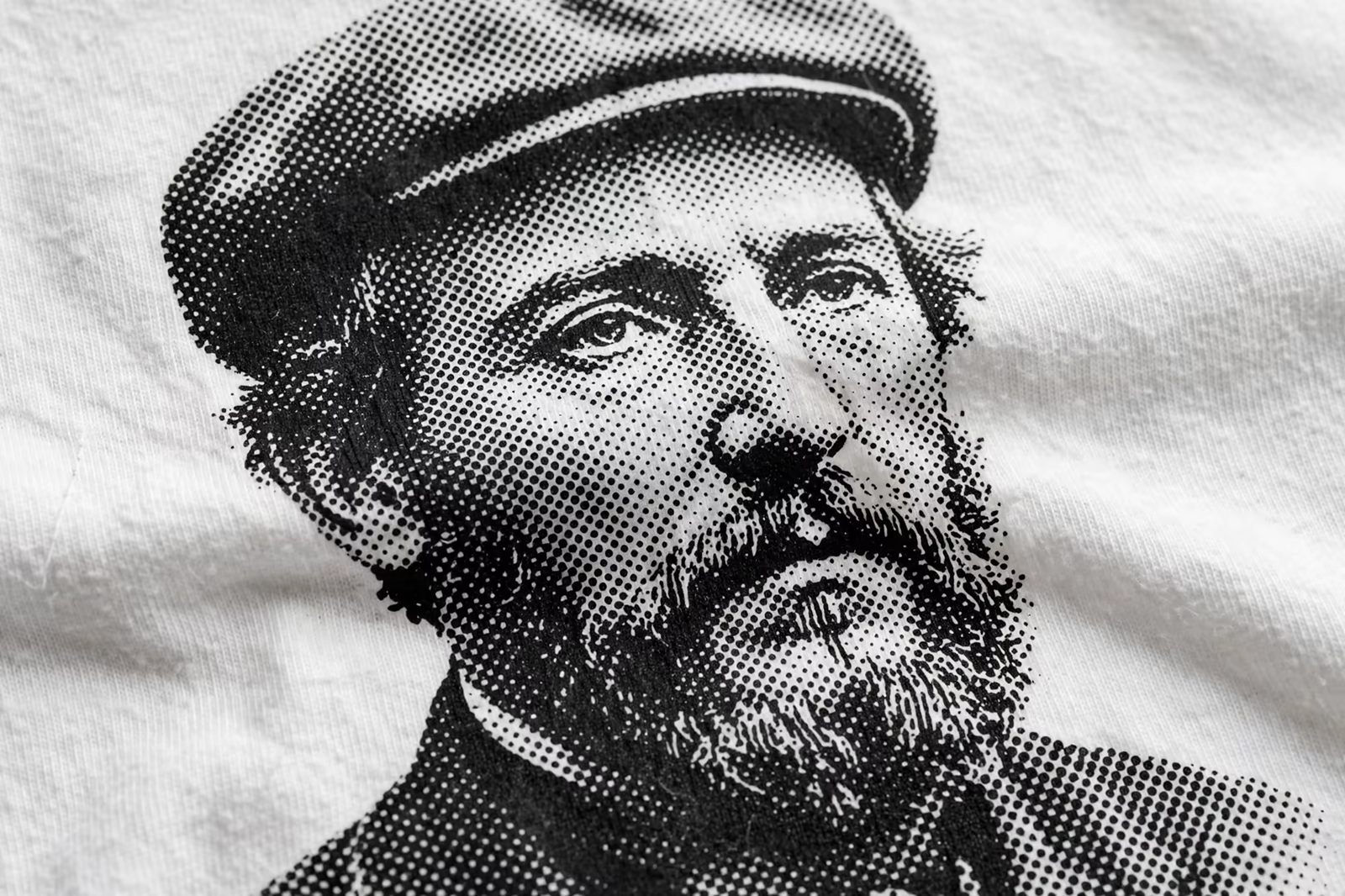
The halftone is the oldest trick in the trade: print a single ink as dots of varying size, and the eye reads large dots as dark, small dots as light, and the spaces between as the fabric’s own tone. One screen, one ink, and a full range of shading appears, which is why single-colour photographic designs, vintage portraits and shaded logos print so convincingly in black ink on light garments.
The dot pattern has rules the fabric enforces. Dots must be large enough to survive the mesh and hold on the fibres, so garment halftones are far coarser than paper ones; stand close and the dots are honestly visible, which the trade accepts as the texture of the medium. Designs drawn knowing this, with strong shapes beneath the shading, print beautifully; designs that are nothing but faint gradients dissolve into speckle, and no press setting rescues them.
Simulated Process: Rebuilding a Photo From Spot Colours
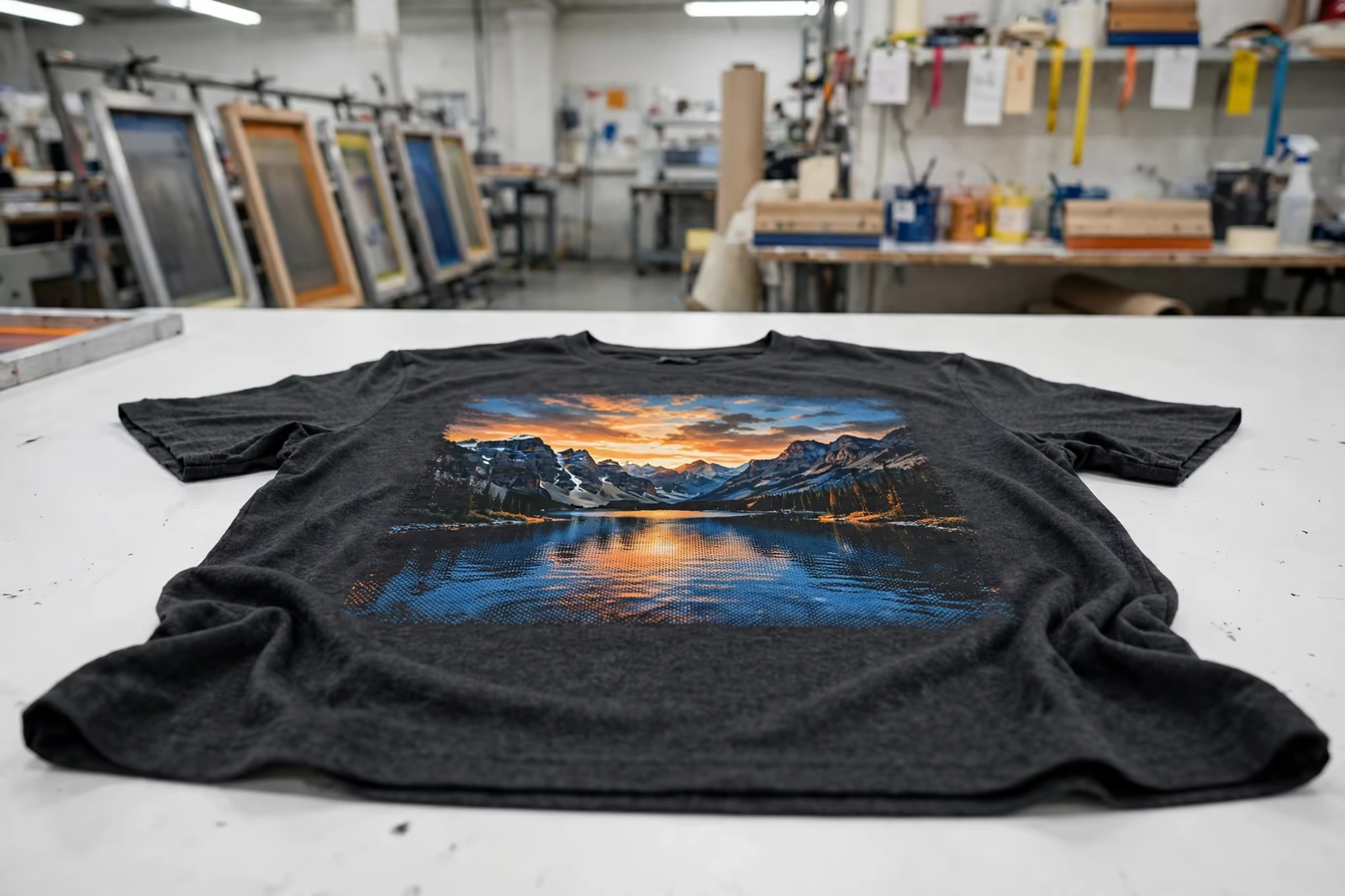
Simulated process is the garment trade’s answer to full colour. Instead of four process inks, a skilled separator rebuilds the photograph from a palette of spot colours, often six to ten, chosen from the image itself: the exact blue of the sky in the photo, the skin tone, the shadow colour, each printed as its own screen in halftone dots that blend on the garment into the full picture.
It earns its name honestly: it simulates the photograph rather than processing it. The method prints on dark garments where true process fails, holds saturated colour that CMYK on fabric cannot reach, and gives the separator creative control, strengthening a weak shadow or rescuing a dull sky at the desk rather than at the press. Most premium photographic apparel, band merch and illustrated fashion prints are simulated process, whether the buyer knew the term or not.
True CMYK Process on Garments: Where It Works
Four-colour process printing does exist on garments, and in its narrow home it works well: white or very light garments, high mesh counts, and images whose colours sit comfortably inside the process gamut. On a white tee, CMYK halftones can render a photograph with real fidelity, and for light-garment programs it can be the economical route to full colour.
Its limits are the mirror of its home. On coloured garments the fabric pollutes every transparent ink; on darks it cannot work without an underbase that changes its character entirely; and its colour range is the smallest of the three methods, so brand-saturated images disappoint. The professional question is never whether process printing is good or bad, but whether this image, on this garment colour, sits inside the ground where it succeeds, and a good factory answers that from the artwork, not from habit.
The Separation Craft Behind Photographic Prints
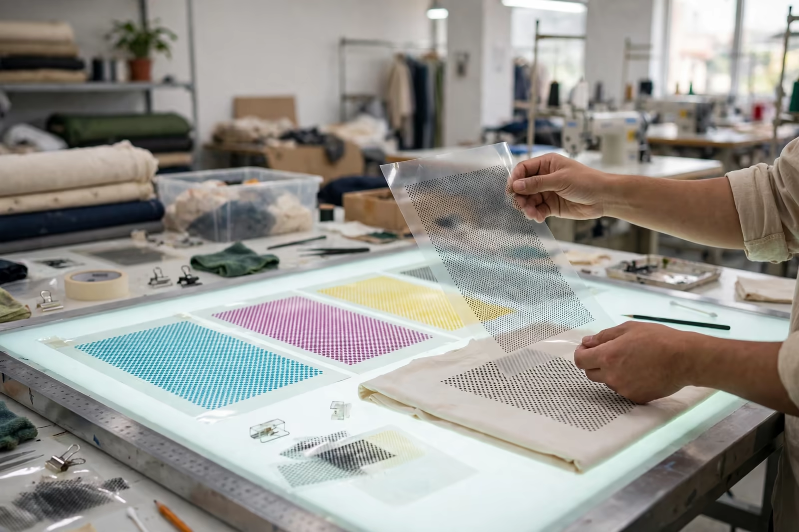
Every technique in this guide is executed or ruined at the separation desk. The separator studies the image, chooses the method and the ink palette, pulls each colour channel out of the artwork, shapes the halftone dots for the mesh that will print them, builds the underbase for dark grounds, and sequences the screens so wet inks meet in the right order. It is hours of skilled judgement before a screen exists.
Buyers feel separation quality as print quality: skin that looks alive rather than sunburnt, shadows with detail rather than mud, edges where the design intended them. Two factories printing the same photograph from the same file can deliver noticeably different garments, and the difference is almost never the press; it is the separation. Asking who separates photographic work, and seeing their previous prints, is the sharpest diligence question in this corner of the trade.
Mesh, Dot Size and Why Detail Disappears
The mesh sets the resolution of garment printing as firmly as pixels set a screen’s. A coarse mesh carries heavy ink and large dots, suiting bold work; a fine mesh carries small dots and fine detail but less ink, suiting photographic separations. The separator matches dot size to mesh so the smallest highlight dots still print and the largest shadow dots do not plug into a solid mass, the two failure edges of every halftone.
This is why fine detail in artwork shrinks in translation. A wispy strand of hair in the photograph becomes a row of dots at the mesh’s mercy, and if the dots are too small they vanish, taking the strand with them. Experienced separators thicken, merge or drop micro-detail deliberately, editing the image for its real medium; buyers approving a photographic strike-off should judge it at arm’s length, the distance the garment will actually be seen at, rather than hunting for the lost pixel the medium never promised.
Garment Colour: The Fifth Ink in Every Print
On light garments the fabric is the print’s white, shining through the halftone gaps and giving the image its highlights for free. On dark garments an underbase supplies that white artificially, a printed ground under the colours, and the image’s brightness hangs on its quality. The same separation printed on white, grey and black garments is three different pictures, because the ground participates in every shade.
Programs sometimes exploit this deliberately: one separation printed across a colour range of garments, each ground tinting the image its own way, a designed variety rather than an inconsistency. But it must be designed. A buyer who approves a photo print on white and orders the bulk on charcoal has changed an ingredient, and the factory that flags this before printing, and re-samples on the real ground, is protecting the program from its most avoidable surprise.
Artwork Buyers Should Supply for Photo Prints
Photographic printing begins with the largest, cleanest image available: the original photograph or illustration at full size, not a version pulled from a website, a screenshot or a social post, each of which has already discarded detail the separator needs. Resolution follows the rule from our artwork guide, a genuine 300 dots per inch at the size the design will print, with headroom for the separator to work.
Tell the factory the garment colours at the same time as the artwork, because the ground decides the method, the palette and the underbase. And name the reference that matters: if one element of the image must be exact, a product colour, a face, a logo inside the artwork, say so, because the separator will protect that element first when compromises are handed out. Files and facts supplied together sample in one round; supplied in sequence, they sample in three.
Approving Photo Prints: Judging the Strike-Off
Approve a photographic print on the physical strike-off, on the real garment colour, under the light the buying standard specifies, and judge it as a garment: at arm’s length, in motion, beside the original image rather than on top of it. The questions that matter are whether skin and key colours read true, whether shadows hold detail, whether the image’s lightest parts are clean rather than speckled, and whether the whole thing has the photograph’s life at the distance customers will see it.
Reject the two false judges. The first is the screen proof, which shows the photograph itself, not its translation, and promises what fabric cannot sign. The second is the magnified inspection, which condemns every halftone ever printed, since dots are the method and not a defect in it. Buyers who learn to judge the translation rather than the photograph approve faster and end up with better prints, because their feedback points at things the separator can actually move.
Cost and Program Fit for Photographic Work
Photographic prints cost more than spot-colour work for honest reasons: skilled separation hours before production, more screens, finer mesh, tighter press control and an approval cycle that deserves its own sample round. The cost sits mostly at the front of the program, which means it spreads kindly over volume and repeats: a re-order reprints from stored separations, and the second season of a proven design is cheaper than its first.
Quantities follow our standard minimum of 1,200 pieces per style in up to two colours, with the photographic design counted as the style’s print. For the right products, music and event merch, fashion graphics, illustrated brands, the method is not a luxury; it is the only route by which the artwork exists on a garment at all, and buyers who cost it as a design asset rather than a print surcharge judge it correctly.
Frequently Asked Questions
What is the difference between halftone and simulated process printing?
A halftone renders shading with dots of a single ink, the eye blending dot sizes into tones. Simulated process rebuilds a full-colour image from several spot inks, each printed in halftone dots that blend into the photograph’s colours. Halftone is one colour with many shades; simulated process is many colours simulating a photo.
Can a photograph be printed exactly as it looks on screen?
Not exactly, and any printer promising it is selling disappointment. The garment version is a translation into dots and inks on coloured fabric, judged at arm’s length. Done well, it carries the photograph’s colours, depth and life convincingly; judged pixel by pixel against a backlit screen, every garment print in the world fails a test its medium never set.
Why does the same design look different on white and black garments?
Because the garment ground is part of the image. On white fabric the cloth supplies the highlights through the halftone gaps; on black garments a printed underbase must supply them, and every colour sits on that ground differently. The separation is adjusted per ground, which is why photo prints are sampled on the actual garment colour.
How many colours does a simulated process print use?
Typically six to ten spot colours, chosen from the image itself, plus an underbase on dark garments. The separator picks the palette the photograph needs rather than a fixed set, which is why two photo prints can carry different screen counts and different costs, and why the artwork has to be seen before the job can be quoted precisely.