

Every brand has a colour it cannot afford to get wrong. It sits on the logo, the packaging, the website header and now, the chest of ten thousand t-shirts, and the customer comparing the shirt to the shopping bag will notice a shade difference the brand team swears nobody can see. Pantone matching is how screen printing answers that pressure: a universal colour language, a physical standard, and a mixing discipline that gets ink on fabric as close to the reference as physics allows.
Pantone matching is checked in Bangladesh under standard light for brands in the UK, France and the Middle East, so the approved colour is the colour that ships.
This guide explains how matching works inside our screen printing process, what affects the result across a full production run, and where to raise questions early through contact with the print team rather than at delivery.
What Pantone Matching Actually Means in a Print Room
The Pantone Matching System is a library of numbered colour standards, each with a published ink formula. When a brand specifies Pantone 286 C for its blue, it is not describing a feeling; it is pointing at a physical colour that any equipped print room in the world can rebuild from base inks using the formula for that number. That shared reference is what makes offshore printing of brand colour possible at all.
On fabric, matching means the printer mixes the ink to the standard, prints it on the actual garment fabric, cures it, and compares the result against the Pantone book under controlled light. The number is the starting point; the printed, cured swatch on the real substrate is the approval. Buyers who understand that distinction approve faster and argue less, because they are judging the thing the customer will actually see.
How Ink Is Mixed to a Pantone Formula
Mixing starts from base colours on a scale. The Pantone formula guide gives proportions by weight, and the printer weighs each base ink precisely, because mixing by eye gets close once and never the same way twice. A draw-down or a test print on fabric follows, the colour is read against the book, and small corrections, a touch more of one base, a whisper less of another, walk the mix onto the standard.
The approved mix is recorded by weight, not by memory, so the colour can be rebuilt exactly for the second production run and the re-order next season. This bookkeeping is unglamorous and it is the entire difference between a factory that matches colour and a factory that matched it once. When a buyer approves a strike-off, the formula behind it should exist on paper.
Why Fabric Changes the Colour You Approved
Ink does not print on paper. The same mixed ink reads differently on white cotton, natural cotton, a heather blend and a black garment under an underbase, because the fabric’s own colour and texture join the result. A fine fabric lets a print sit smooth and saturated; a coarse, slubbed fabric breaks the ink film into texture and lightens the read by a fraction.
Dyed garments add a second variable: the garment dye lot itself varies slightly between batches, and a print matched perfectly against last month’s black will sit on a fractionally different black this month. None of this is failure; it is textile physics. It is why professional approvals are always made on the production fabric from the production dye lot, and why a Pantone number alone, without a fabric strike-off, is an intention rather than a match.
Light: The Silent Partner in Every Colour Decision
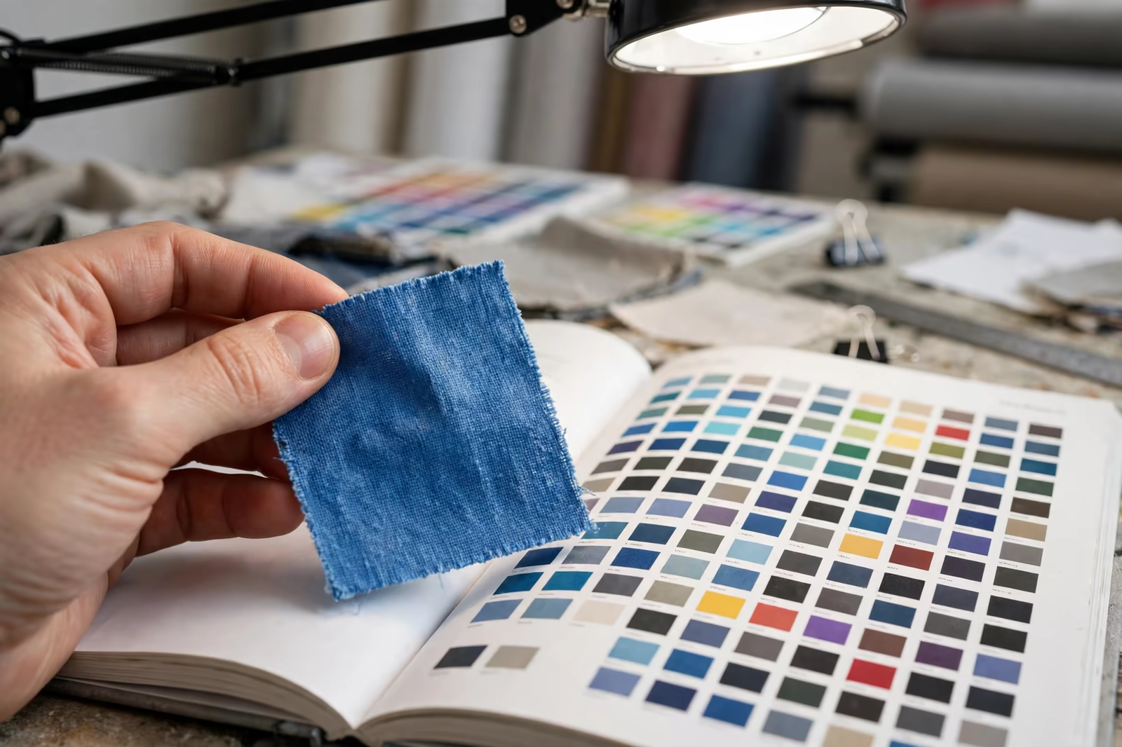
Two colours that match under one light can separate under another, a phenomenon called metamerism, and print rooms defend against it with standard light. Colour is approved under a D65 daylight-equivalent source, the trade’s reference, and checked again under store fluorescent light, because that is where the garment will be judged by the customer.
Buyers approving colour from phone photographs are approving through a chain of screens, cameras and compressions that no factory can match to, and disputes born there are nobody’s fault and everybody’s cost. The professional route is physical: a cured strike-off, viewed in a light booth or honest daylight, signed, and kept by both sides as the standard the bulk will be held to.
Which Pantone Reference Should a Garment Buyer Use?
Not every Pantone book speaks for fabric. The familiar coated and uncoated guides describe ink on paper, and they remain the trade’s common language because brands hold their identity there. Pantone also publishes a textile system, the Fashion, Home and Interiors range on cotton, whose references describe colour on cloth directly and account for how fibre drinks light differently from paper.
Either reference can govern a program, provided both sides use the same one and say so. Trouble starts when the brand approves from a paper guide, the factory mixes to a textile swatch, and each side is honestly matching a different standard. The specification should name the system as well as the number, one line in the tech pack that prevents the most avoidable colour dispute in the trade. Where a brand’s identity lives on paper, the factory’s fabric strike-off becomes the bridge document between the two worlds.
How Close Can Screen Printing Honestly Get?
The honest answer is: very close, within a tolerance the eye accepts as the same colour, and rarely molecule-identical. Trained colourists judge matches in Delta E terms, and commercial apparel printing typically works to a tolerance where differences are visible only side by side under scrutiny, not in wear. A brand blue printed this season and next, by the recorded formula on the same fabric, will read as one colour across a rail.
What screen printing cannot promise is paper-proof perfection on a textile. Fibre, texture, ink film and light all take their small tax. Brands that demand the impossible get factories that promise it anyway and deliver approximations with confidence; brands that agree a tolerance get factories that measure against it and report honestly, which is the relationship that survives re-orders.
Underbases, Opacity and Matching on Dark Garments
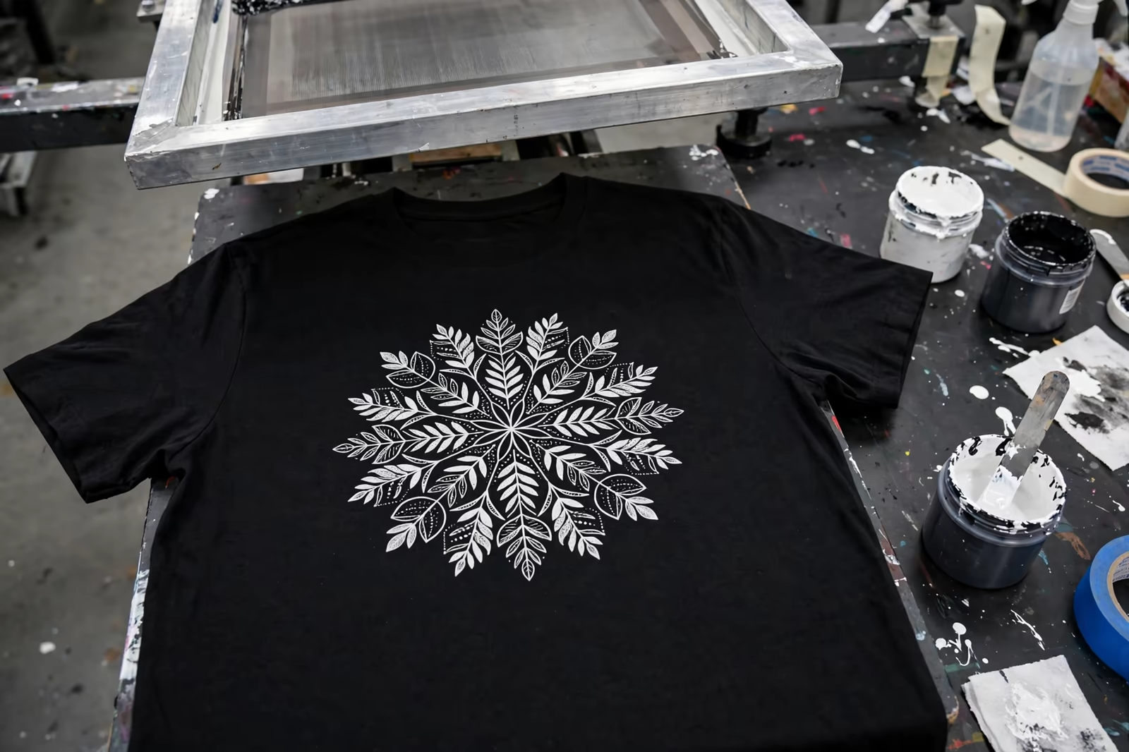
On dark garments the match is built on a foundation: a white underbase printed and flashed first, over which the colour sits. The underbase’s own brightness becomes part of the colour, too grey and the blue dulls, too bright and it can push the colour light, so the printer tunes base and top together rather than matching the colour on white and hoping.
Some colours fight harder than others. Fluorescents cannot be matched from standard bases at all and need specialty inks. Metallics shift with viewing angle by design. Deep reds and purples on dark bases are famously sensitive to film thickness. A print team that flags these at quotation, and prices the extra hits honestly, is giving the buyer information while it is still cheap.
Approving Colour: The Strike-Off Discipline
The approval sequence that works is simple and strict. The factory prints the colour on production fabric, cures it fully, and sends a physical strike-off with the formula reference recorded. The buyer views it beside the Pantone book under daylight-standard light, approves or comments once, clearly, and the signed sample becomes the bulk standard, one copy at the factory beside the press, one with the buyer.
Mid-run, the printer pulls garments at intervals and checks them against that standard under the same light, because ink in a screen across a long run can drift as it is worked and topped up. Catching a half-shade of drift at garment two hundred is a correction; discovering it at packing is a claim. The interval checks are part of how our runs are produced and part of what a buyer is paying for in a managed program.
Re-Orders and Colour Continuity Across Seasons
The second order is where matching systems prove themselves. With the formula on record, the fabric specified the same and the approval standard retained, a re-order’s colour should land inside the same tolerance as the first run, so a customer’s new shirt matches the one bought last year. Where continuity breaks is usually upstream: a changed fabric supplier, a different garment dye standard, a new ink range substituted quietly.
Buyers protect continuity by holding the variables still: same fabric specification, same ink system, formula and standard sample on file. Factories protect it by refusing silent substitutions. Between the two, a brand colour becomes boring in the best possible way, the same on every garment, in every market, season after season.
When a colour genuinely cannot be matched inside tolerance, the professional conversation happens early and in the open: the printer shows the nearest achievable result on the real fabric, explains which variable blocks the match, and offers routes, a specialty ink, a different underbase build, or a fabric change, each with its cost. Brands accept honest near-matches far more readily than surprised ones, and a program that surfaces the problem at sampling almost never argues about it at delivery.
Specifying Pantone Colours in Your Print Program
Specify each colour by its Pantone number with the coated reference, name the fabric and garment colour it prints on, agree the tolerance in plain words, and build physical strike-off approval into the calendar before bulk. Quantities follow our standard minimum of 1,200 pieces per style in up to two colours, with colours counted per design.
And keep the signed standards. The Pantone book gets a program most of the way; the cured sample on your fabric, approved under proper light, is what carries a brand colour safely across an ocean and a production run.
Frequently Asked Questions
Can screen printing match a Pantone colour exactly?
It can match within a tight commercial tolerance that the eye accepts as the same colour, verified on the actual fabric under standard light. Molecule-perfect identity is not achievable on textiles because fibre, texture and ink film all influence the result. Professional programs agree the tolerance in advance and hold production to a signed strike-off.
Why does my printed colour look different from the Pantone book?
The book is ink on coated paper viewed in ideal conditions; the print is ink on fabric, with the garment’s colour, texture and dye lot in the mixture, often over an underbase on dark garments. Light matters too: colours are approved under a daylight standard because they shift under other sources. A fabric strike-off is the true reference.
Should I approve print colours from photos or PDFs?
No. Screens and cameras reinterpret colour at every step, so a photo approval cannot be matched or fairly disputed later. Approve a physical, cured strike-off on the production fabric, beside the Pantone book, under daylight-standard light, and keep a signed copy on both sides as the bulk standard.
Will the colour stay the same on my re-order next season?
Yes, when the variables are held still: the ink formula recorded by weight, the same fabric specification and garment dye standard, and the retained approval sample to compare against. Colour continuity fails when something upstream changes silently, so both sides protect the record rather than relying on memory.