
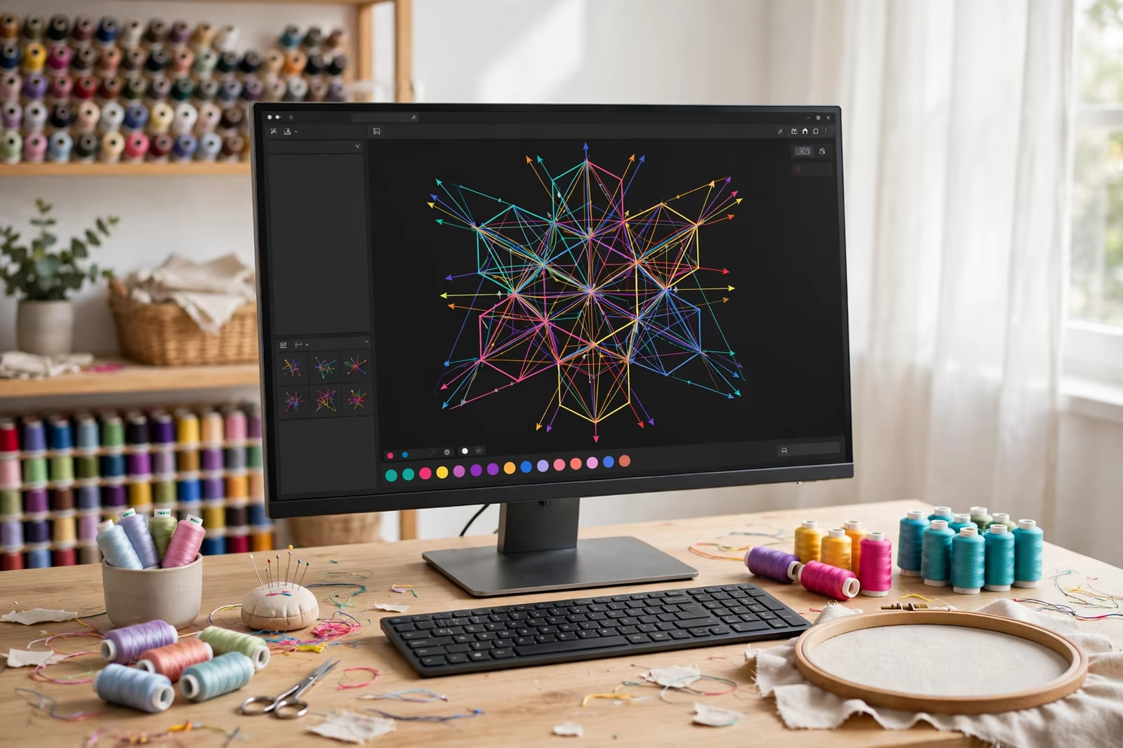
A printed logo lies on a garment; an embroidered logo is built into it, thread by thread, thousands of stitches deep. That difference is why embroidery carries a weight other decoration cannot imitate, and why it works by rules of its own. A logo cannot simply be sent to a machine the way a file is sent to a printer. Between the artwork and the chest of a polo shirt sits a craft called digitizing, and everything about the finished logo, its sharpness, its cost, its survival in the wash, is decided there.
Digitising for buyers in the USA, the UK and Germany is done in Bangladesh against the actual garment fabric, so the approved sew out matches what bulk production will stitch.
This guide explains how logo embroidery works inside our embroidery programs, on garments such as the classic pique polo shirt, and what to send through get a quote when your program needs decoration that outlasts the garment it sits on.
From Artwork to Stitches: What Digitizing Actually Does
Digitizing translates a flat design into a stitch map: a file that tells the machine where every needle penetration goes, in what order, at what density, and with which stitch type. The digitizer redraws the logo by hand inside specialist software, deciding how a curve will be built from stitches, where a fill will change direction to catch the light, and how the design will pull against the fabric so the finished size matches the intended one.
This is skilled interpretation, not conversion, which is why the same artwork digitized by two hands produces two different logos. A good digitizer compensates for thread behaviour, fabric stretch and the physics of stitch formation before the machine ever runs; a poor one produces a file the machine follows faithfully into puckered, gappy work. When a buyer asks what they are paying for in an embroidery setup, this is it: judgement, encoded stitch by stitch.
Stitch Types: The Vocabulary of an Embroidered Logo
Three stitch families build nearly every logo. Satin stitch, a column of threads laid side to side, forms letters and narrow shapes with a smooth sheen. Fill stitch, rows of penetrations covering an area, builds the bodies of larger shapes with a textured, woven surface. Running stitch, a single line, handles fine outlines and details too small for the other two. A logo is a sentence written in these three, and its quality is grammar: each element built from the stitch that suits its size.
The sizes matter absolutely. Satin columns have a width range inside which they lie beautifully and outside which they loop or split; fills need room to show their texture; lettering has a minimum height below which no digitizer can save it. Understanding this vocabulary is what lets a brand adapt a logo for embroidery intelligently, keeping the design’s identity while letting each element speak in a stitch that can actually say it.
Hooping: Holding a Garment Still for Ten Thousand Stitches
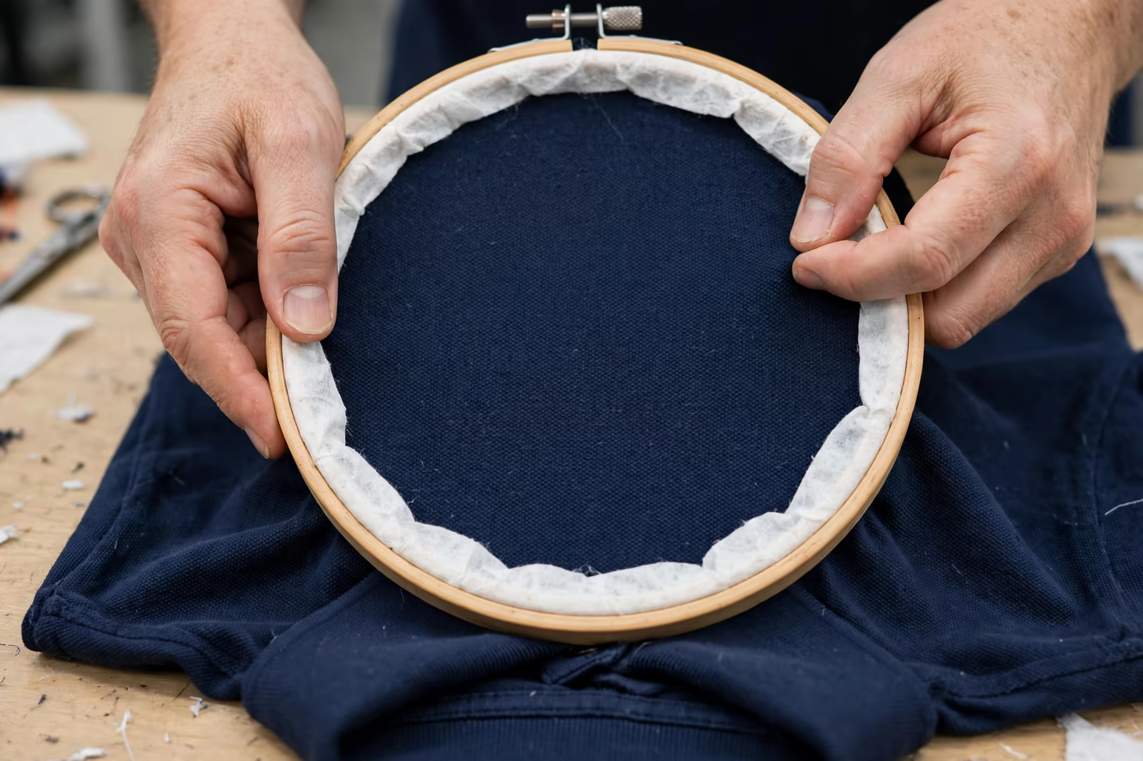
Before a stitch is sewn, the garment is hooped: clamped in a frame with stabilising material, stretched evenly and held at exact position so the machine’s map lands where the chest expects it. Hooping is the placement craft of embroidery, and it is done by eye and hand, garment by garment. A hoop set a few millimetres off, or tensioned unevenly, produces a logo that is perfectly stitched in the wrong place or releases into a pucker when the frame comes off.
Pique polo fabric, the classic embroidery ground, is knitted and elastic, which makes hooping a genuine skill: too tight and the garment distorts, too loose and the stitches pull it into waves as they form. The hoop leaves its own discipline on the program too, because its size bounds the design; a logo wider than the hoop is a logo that gets sewn in two passes with a join, or not sewn at all until the artwork respects the frame.
The Machine Run: Needles, Threads and Trims
Production embroidery runs on multi-head machines, several garments stitching the same design at once, each head carrying a bank of needles threaded with the design’s colours. The machine follows the digitized map exactly: sewing order planned so colours build cleanly, threads trimmed between elements, the design emerging in layers. An operator watches tension, thread breaks and registration, because a machine will sew a mistake at full speed with total confidence until a human stops it.
What the buyer sees in this is consistency and its limits. Properly run, every garment in the batch carries the same logo in the same place, which is embroidery’s great production virtue. What varies is the garment beneath it: fabric behaviour, placement by hand at hooping, the small physics of real cloth. Programs are specified with tolerances that respect both truths, machine precision checked by human sampling at set intervals through the run.
Placement and Sizing: Where Logos Live on Garments
Embroidery has its settled geography. The left chest is the classic corporate position, sized modestly so the logo reads at conversation distance; the cap front takes a smaller, height-limited version between its seams; sleeves, cuffs and the back yoke carry secondary marks. Each position has a working size range set by the garment, the hoop and stitch physics, and logos are drawn to the position rather than the position being stretched to the logo.
Sizing is a translation exercise. A logo designed wide for a chest may carry text that fails at cap height; a mark perfect at chest size can lose its fine lines when reduced. Mature programs hold an embroidery version of the artwork per placement, each one simplified exactly as much as its size demands, approved as sew-outs, so the brand reads the same at every position while no position asks thread to do what thread cannot.
Thread: Colour, Sheen and Survival
Embroidery thread is the pigment of the process, and its choices echo through the logo’s life. Rayon gives a deep sheen and rich colour; polyester gives slightly less glow and notably more resistance to bleach, sunlight and hard washing, which is why workwear and hospitality programs lean to it. Threads are chosen from physical shade cards, matched by eye in daylight, because a screen’s idea of a brand colour and a thread’s reality are different countries.
Special threads exist for special briefs: metallics for ceremony, matt threads for a modern flat look, fine weights for delicate work. Each carries handling consequences the digitizer must design around, slower speeds or adjusted densities, and each should be specified for a reason the garment’s use explains. Thread is not a finishing detail in embroidery. It is the material the logo is made of, and it deserves the same seriousness as fabric in the garment spec.
Backing: The Invisible Half of Every Logo
Behind every embroidered logo sits backing, the stabiliser that gives stitches something to hold while they form and keeps the design flat through the garment’s life. Cut-away backing stays with the garment permanently and suits knits like pique that stretch under stitch tension; tear-away suits stable wovens and removes cleanly. The choice is structural, and the wrong one shows within weeks as puckering, distortion or a logo slowly eating its own edges.
Buyers rarely see backing discussed in quotes, which is a pity, because it is one of the honest places cheap embroidery cuts its cost. Too light a backing, or none where the design needs it, saves pennies and spends the logo. Ask what backing a program uses on your garment type and accept the slightly stiffer hand behind a dense design as the price of a logo that stays flat for the garment’s whole working life.
Sampling: The Sew-Out That Decides Everything
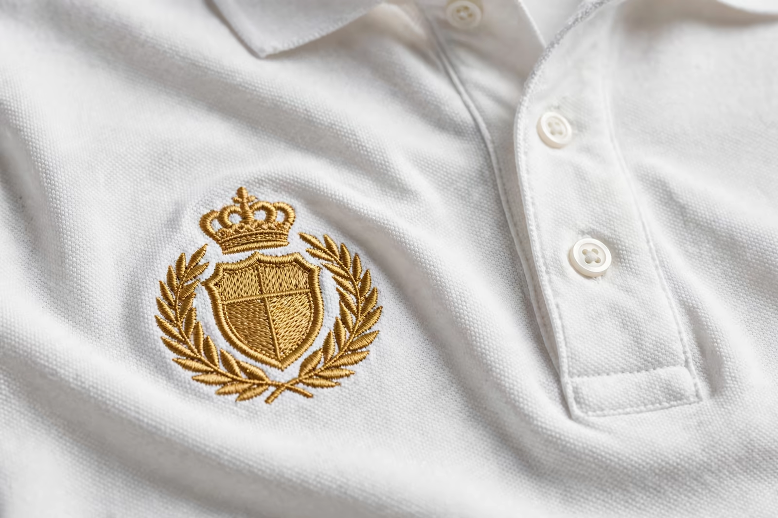
A design is proven by sewing it, on the production fabric, at production size: the sew-out. It reveals what no screen preview can, pull distortion, gappy fills, letters closing up, colours reading differently in thread than in ink. One sew-out, honestly examined, usually sends the digitizer back for adjustments; the second confirms them. Programs that skip this loop to save days spend weeks wearing its absence on every chest in the order.
Approve the sew-out as an embroidered object, not as a photograph of one, whenever the program is new: hold it, stretch the garment gently, check the back for backing and clean trimming, and wash it once before the bulk is released if the garment will live a washed life. The sew-out is the contract in thread. Everything after it is repetition, and repetition is what machines do best once the standard is set.
Embroidery or Print: Choosing With Open Eyes
Embroidery’s virtues are permanence, texture and perceived value; a stitched logo cannot crack or peel, survives industrial washing that ends prints, and reads as quality at a glance. Its limits are detail, size and gradient: thread cannot render a photograph or letters below its minimum, and large designs grow heavy and costly stitch by stitch. Print inverts the profile, unlimited detail and area, a surface that wear eventually reaches. Neither wins; the garment’s job decides.
Many strong programs use both, embroidery where the brand mark lives daily on chests and caps, print where a campaign design needs scale and colour. The buyer’s task is to route each artwork to the process whose strengths match it, and to let the factory argue the routing with sew-outs and strike-offs in hand. Decoration chosen by habit decorates by accident; decoration chosen by fit looks deliberate on every garment.
Specifying an Embroidery Program
A complete embroidery specification sends the artwork as vector where possible, names each placement with its size, lists thread colours from a physical card or an accepted sew-out, and states the garment fabrics so backing and digitizing can be planned for them. Quantities follow our standard minimum of 1,200 pieces per style in up to two colours, and the embroidery is costed from the design itself, since stitch count, not garment count alone, sets the work.
Keep the approved sew-out and the digitized file as program property records, because they make every repeat exact and every future placement translation faster. Embroidery rewards programs that treat it as a system, artwork, file, thread and backing held together, and it repays them with the rarest property in decorated apparel: a logo that looks as good in its third year as on the day the cartons were opened.
Frequently Asked Questions
What is digitizing and why is it charged as setup?
Digitizing is the skilled translation of artwork into a stitch map the machine can sew: stitch types, order, density and fabric compensation decided element by element. It is charged as setup because it is skilled work done once per design, and its quality decides whether the logo sews sharply or puckers on every garment that follows.
Why can my logo not be embroidered exactly as drawn?
Thread has physical limits: letters below a minimum height close up, satin columns fail outside their width range, and gradients cannot be stitched. A good program keeps an embroidery version of the artwork per placement, simplified exactly as much as size and stitch physics demand, and proves it with a sew-out before bulk.
What backing should sit behind my logo?
Knitted garments such as pique polos usually need cut-away backing that stays in the garment and holds the design flat against stretch; stable wovens can use tear-away. The wrong or too-light backing is a classic false economy that returns as puckering and distortion within weeks of wear and washing.
How is an embroidery sample approved?
By a sew-out: the design stitched on the production fabric at production size, examined in the hand for pull, density, legibility and clean trimming, and ideally washed once before release. Photographs are useful for placement, but the sewn sample on the real garment is the only approval that predicts the bulk honestly.