
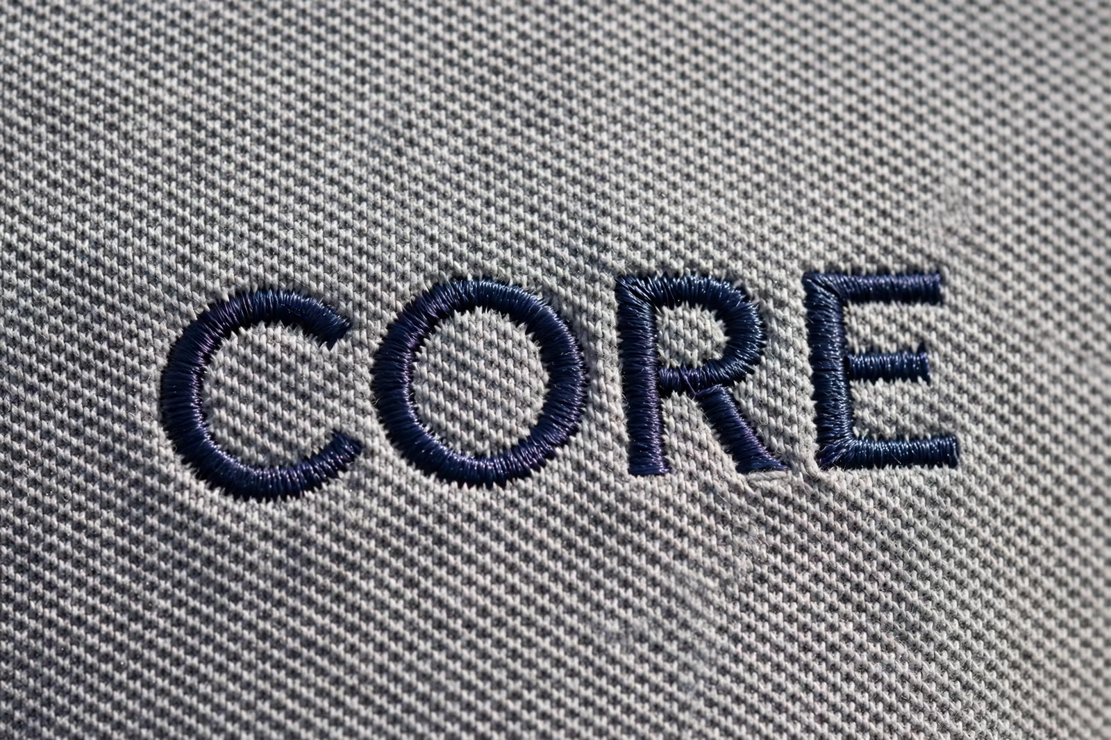
Every embroidery program eventually meets the same small tragedy: a line of text, perfectly crisp in the artwork, that sews out as a row of knots nobody can read. Thread is a physical material with a width of its own, and below a certain size it stops being a writing instrument and becomes texture. The legibility rules of embroidery are not matters of taste. They are physics, and brands that design with them get logos that read at a glance on every garment, while brands that fight them get expensive reminders sewn onto ten thousand chests.
Small text rules are proven in Bangladesh on sew outs for uniform buyers in the UK, France and the Middle East, where a letter that fills in is a logo rejected.
This guide sets out the rules as we apply them inside our embroidery programs, on garments such as the baseball cap. Questions on a specific logo are welcome through contact before artwork is finalised.
The Minimum Letter Height, and Why It Exists
Satin stitch, the stitch that forms letters, is a column of thread laid across a narrow band. Below a minimum column width the stitches have nowhere orderly to lie: they bunch, split or sink into the fabric, and the letter’s counters, the enclosed spaces in an a, e or o, fill in completely. In practice this puts a floor under capital letter height for standard thread, commonly around five to six millimetres for clean results, with anything smaller entering the territory of luck.
The floor is not a factory’s caution but the material’s geometry, and it does not negotiate. A digitizer can cheat it slightly with fine thread and adjusted density on smooth fabric, buying perhaps a millimetre, and no more. Artwork designed above the floor sews crisply for years; artwork designed beneath it produces the program’s defining defect, repeated with machine precision on every single garment, which is the most expensive place a small saving of space can lead.
Counters, Apertures and the Letters That Fail First
Letters fail in a predictable order. Enclosed counters close first: a, e, o, p and their capitals become blobs as thread crowds their centres. Narrow apertures follow: the openings of c, s and n bridge over, and fine joins between strokes merge into knots. The casualties are always the design’s smallest features, which is why a logo can survive reduction gracefully in its symbol while its tagline quietly dies underneath it.
The sew-out exposes all of this honestly at production size, which is why it is read with the naked eye at arm’s length rather than admired as a magnified photograph. A proof enlarged on a screen lies kindly; the garment tells the truth. Programs approve lettering on the garment, in normal light, at the distance a customer will stand, and they treat anything that needs squinting as failed, however loyal it is to the original artwork.
Fonts That Survive Thread, and Fonts That Do Not
Typefaces carry their suitability in their bones. Bold and medium-weight sans-serif faces, with even stroke widths and open counters, sew beautifully at small sizes because their geometry matches what satin stitch can build. Light weights vanish, hairline serifs break, high-contrast display faces with thin horizontals lose exactly the strokes that make them elegant, and scripts join into rope where their letters were designed to flow.
The practical rule is to hold an embroidery cut of the brand’s typography: the same family, in a weight chosen for thread, with letter spacing opened slightly so columns do not crowd. Brands with strict identity guidelines plan this cut in advance, approved once and used everywhere, rather than negotiating it under deadline on each new garment. Where the house font cannot survive at the needed size, a close, sturdy relative is chosen deliberately, and the difference is invisible to everyone except the people who measure such things for a living.
Spacing: The Quiet Half of Legibility
Letters fail as often from crowding as from size. Stitches pull fabric inward as they form, columns sit slightly wider than drawn, and thread has a halo of texture at small scale, so letterforms spaced for print touch and merge in thread. Digitizers compensate with opened tracking and adjusted column widths, but the artwork can help more: text set with breathing room sews open, and text squeezed to fit a width is a legibility problem purchased at the design desk.
Line spacing obeys the same physics when a logo carries two lines of small type. Lines set close interact, the fabric between them worked twice and prone to pucker, and the eye reads the pair as one dense block. One line, sized honestly, nearly always beats two lines squeezed, which is why so many experienced programs move their taglines off the chest entirely and let the symbol carry the position alone.
Fine Lines, Outlines and Detail Below the Thread’s Width
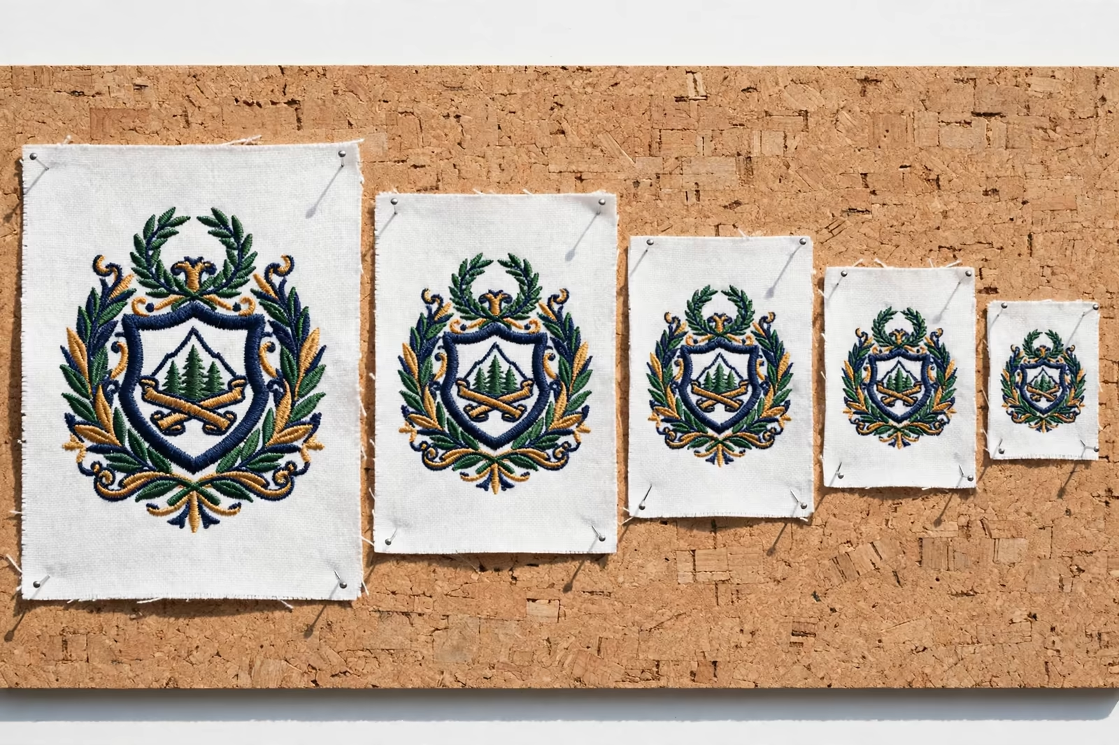
A single running stitch is the finest line embroidery can draw, and it has the width of the thread itself. Any artwork line thinner than that exists only in the drawing: hairlines around a shield, pinstripes in a flag, the engraved shading in a crest. At production these either thicken into the running line, changing the design’s character, or vanish into gaps. Neither outcome is a defect of the sewing; both are the honest translation of an impossible instruction.
The design answer is to redraw fine elements at thread scale: outlines given the running stitch’s true weight, shading converted to tone changes in fill direction or colour, micro-details merged into the shapes they decorated. Done at the artwork stage, this translation is invisible as a compromise because the logo still reads exactly as itself. Done by the machine without guidance, it reads as loss, because the machine thickens and merges by its own blunt arithmetic.
Caps: The Strictest Canvas in the Program
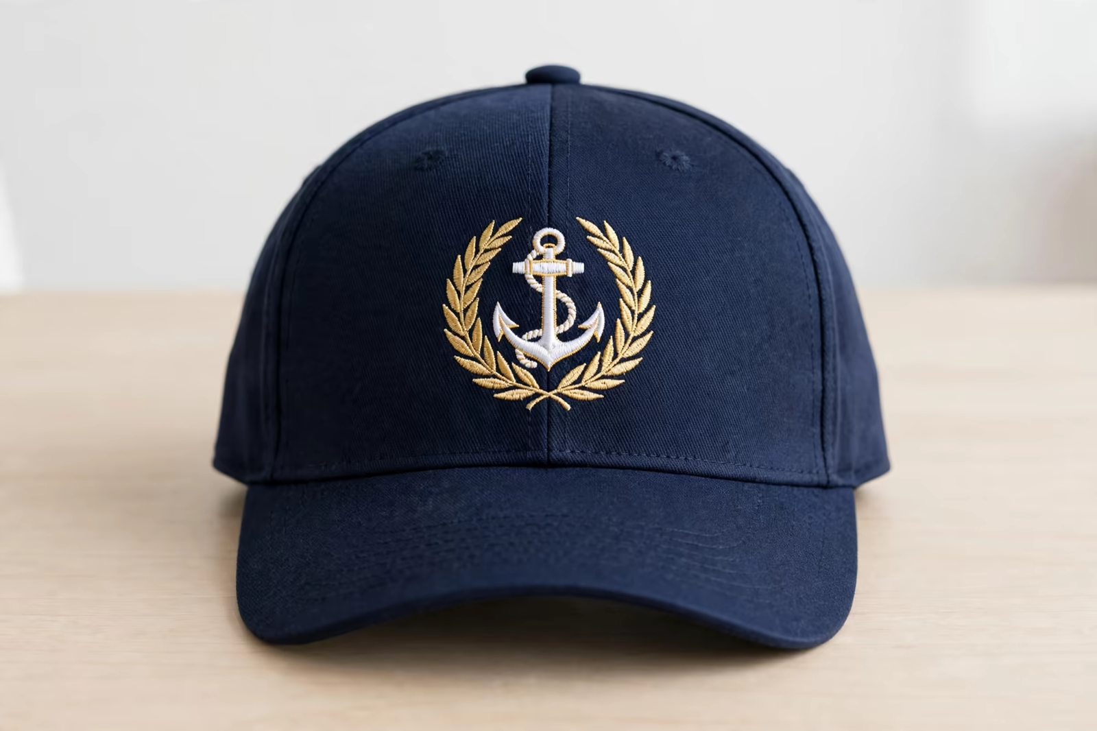
Cap fronts impose the tightest limits in embroidery: a curved, structured panel with a centre seam, a working height of only a few centimetres, and fabric that resists the needle differently from any flat garment. Lettering that reads happily on a chest can fail on a cap at the same size, because the curve shortens the effective height and the seam interrupts columns that cross it. Cap logos are therefore their own artwork version, simplified hardest of all the placements.
The discipline that works is hierarchy: the symbol or the name, rarely both, sized to the panel with margin to spare, and every secondary line removed or moved to the cap’s back or side where flat, smaller panels set their own gentler rules. A cap that tries to carry the full lockup carries a smudge; a cap that carries one strong element carries the brand further than the full lockup ever did at sizes nobody could read.
When to Print the Small Print Instead
Some information should never be asked of thread: care-sized legal lines, long taglines, web addresses in full, anything whose purpose requires reading at small size. Print renders these effortlessly, and a program is not diminished by routing each element to the process that can carry it. Embroider the mark that must last and read at distance; print the text that must merely be read. The garments look deliberate because they are.
Hybrid programs plan this split from the start, the embroidered chest mark paired with a printed back text, each at its natural size. What fails is the afterthought: embroidery attempted first because it feels premium, then rescued by print after the sew-out confesses. The routing decision belongs with the artwork, where it costs nothing, and a factory that raises it there is protecting the program, not declining the work.
Testing Legibility Properly: The Arm’s Length Rule
Legibility is judged where it will be used: on the garment, worn or held as worn, in ordinary light, at conversational distance. The sew-out that passes this test passes in the world. The one that needs magnification, apology or the phrase “you can tell what it says” has failed, and no loyalty to the supplied artwork changes the verdict, because the customer reading the garment owes the artwork nothing.
Keep the passed sew-out as the standard beside the rejected one; programs learn faster with the evidence in hand. And revisit the artwork file itself, marking the embroidery cuts of the logo as official versions, so next season’s new placement begins from the legible file rather than from the original that failed. Legibility, once earned, should be kept where the program can find it again.
Fabric Moves the Floor Up or Down
The legibility floor is not a single number, because fabric votes on it. Smooth, stable wovens hold small letters kindly: stitches sit where they are placed and counters stay open. Knits move under the needle, pique’s textured surface swallows fine columns into its pattern, and fleece buries small work in its pile until only the boldest shapes survive. The same lettering file can pass on a shirt and fail on a hoodie, both sewn perfectly, because the ground changed the arithmetic.
This is why embroidery versions are kept per garment family, not only per placement, and why the sew-out is always on the production fabric. A buyer approving small text from a sample on smooth cotton has approved it for smooth cotton alone. The rule costs one extra sew-out per fabric, and it saves the oldest disappointment in the trade: a program that was legible everywhere except on the garments it was actually for.
Specifying Text in an Embroidery Program
A complete specification names the text’s size per placement as a height, confirms the font cut approved for thread, and records which lines exist at which sizes, including the sizes where a line is dropped. Quantities follow our standard minimum of 1,200 pieces per style in up to two colours, with the embroidery digitized per placement so each position’s text is built for its own dimensions rather than scaled blindly from the master.
Send the artwork early enough for the legibility conversation to happen while it is still free. Every rule in this guide is cheaper at the design desk than at the sew-out, and the sew-out is cheaper than the bulk by the whole weight of the order. Small text is where embroidery programs are won quietly, in millimetres, long before a machine is switched on.
Frequently Asked Questions
How small can embroidered letters be?
For standard thread in satin stitch, capital letters need roughly five to six millimetres of height to keep their counters open and read cleanly; below that, enclosed letters fill in and fine strokes merge. Fine thread and smooth fabric can buy a little room, but the floor is set by the thread’s own width and does not move far.
Why did my tagline sew out as a blur?
Because taglines are usually set below the legible floor: counters closed, letters crowded by stitch pull, and lines interacting. The usual cure is to enlarge it, move it to a print position, or drop it at small placements and keep it only where the size allows, a decision best made at the artwork stage with a sew-out in hand.
Which fonts work best for embroidery?
Medium and bold sans-serif faces with even strokes and open counters sew most reliably at small sizes. Light weights, hairline serifs and high-contrast display faces lose their thin strokes in thread. Most brands hold an approved embroidery cut of their typography, same family, sturdier weight, slightly opened spacing.
Can small text work on a cap?
Only within the cap’s stricter limits: a short working height, a centre seam and a curved panel all reduce what thread can say. Cap artwork is its own simplified version, usually the symbol or the name alone at honest size, with secondary lines moved to the back or side panels or dropped entirely.