
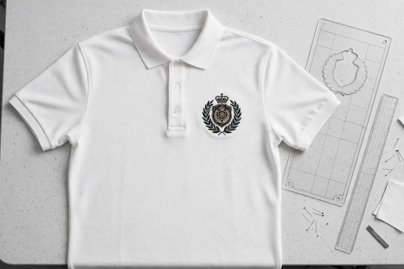
A logo in the wrong place is a defect no stitch quality can repair. Embroidery placement looks like a matter of taste, but it is governed by anatomy, garment construction and the physics of hoops: the chest has a centre the eye expects, seams and pockets fence off whole territories, and every garment type has positions where a design sits naturally and positions where it fights the clothing. Buyers who learn the placement map specify faster, approve samples with confidence and stop paying for logos that drift.
Placement charts are proven in Bangladesh on sew outs for buyers in the USA, Canada and the UK, so a chest logo sits in the same position on the first garment and the last.
This guide sets out the standard positions inside our embroidery programs, from the polo chest to the baseball cap front and the back of a softshell jacket.
The Left Chest: The Centre of the Embroidered World
The left chest, the wearer’s left, is the default position for corporate and uniform logos, and its placement is measured, not eyeballed: centred on the chest panel at a set distance below the shoulder seam and in from the centre front, so it sits over the heart where handshakes and name badges have taught the eye to look. Sizes in this position run modest, wide enough to read at conversation distance, small enough to sit flat between the placket and the armhole without crowding either.
Polos add their own fences: the placket and buttons on one side, the sleeve seam on the other, and on some styles a pocket that owns the territory outright. The digitized design is sized to the smallest garment in the run’s size range first, because a logo that fits the smallest chest fits all of them, while one drawn for the largest rides seams and folds on the small sizes that nobody sampled.
Right Chest, Sleeves and Cuffs: The Supporting Positions
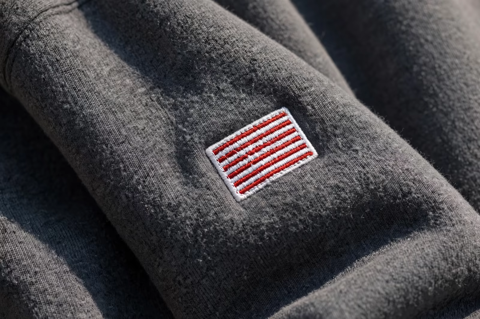
The right chest most often carries a name, a flag or a secondary mark, balanced visually against the main logo rather than rivalling it: smaller, quieter, aligned on the same horizontal line so the pair reads as one considered layout. Sleeve placements run along the upper arm, sized to the arm’s curve and kept clear of the elbow’s working zone; they read as accents, membership marks and sponsor slots, and they are sewn before the sleeve is closed or with specialised hooping on finished garments.
Cuff and hem positions are the connoisseur’s territory: a tiny mark at the cuff of a shirt or the hem of a polo, placed where only a close look finds it. They obey the legibility rules strictly, because their sizes are the smallest in the program, and they are specified as symbols rather than words for exactly that reason. A placement map that uses the supporting positions with restraint looks designed; one that fills every position looks decorated by committee.
Shirts: Plackets, Pockets and the Yoke
Woven shirts place their logos with the placket as the reference: left chest above the pocket where a pocket exists, or at the pocket’s position where it does not, so a fleet looks uniform across styles. The yoke, the panel across the upper back, takes a centred mark below the collar where it shows above a jacket or apron line, a favourite of hospitality programs whose staff are seen from behind as often as from the front.
Shirt fabrics hold embroidery kindly, being stable, but their lighter weights demand respect in density and backing: a heavy design on a fine shirt distorts the cloth around it no matter where it sits. Placement cannot fix a density error, which is why the sew-out for shirts is judged on the shirt, hanging, and not on the sample table where every fabric behaves.
Caps: Front, Back and the Discipline of Small Panels
The cap front is the most bounded canvas in the program: a centred design between the seams, limited in height by the panel, placed to sit on the forehead’s curve so it reads straight when worn rather than when photographed flat. The cap back takes a small mark above the opening, often the web address or a miniature of the front symbol, and the sides carry tiny flags or initials where a program wants a third touch.
Each cap position is its own digitized version, because the curve, the seam and the panel sizes forbid simple scaling. Programs that treat the cap as a small shirt discover the difference at the sew-out: columns crossing the centre seam wobble, heights that fit the chest overflow the panel. The cap rewards its own artwork, drawn for its map, and repays it by being the most visible logo most wearers own.
Jackets: Chest, Back and the Big Statement
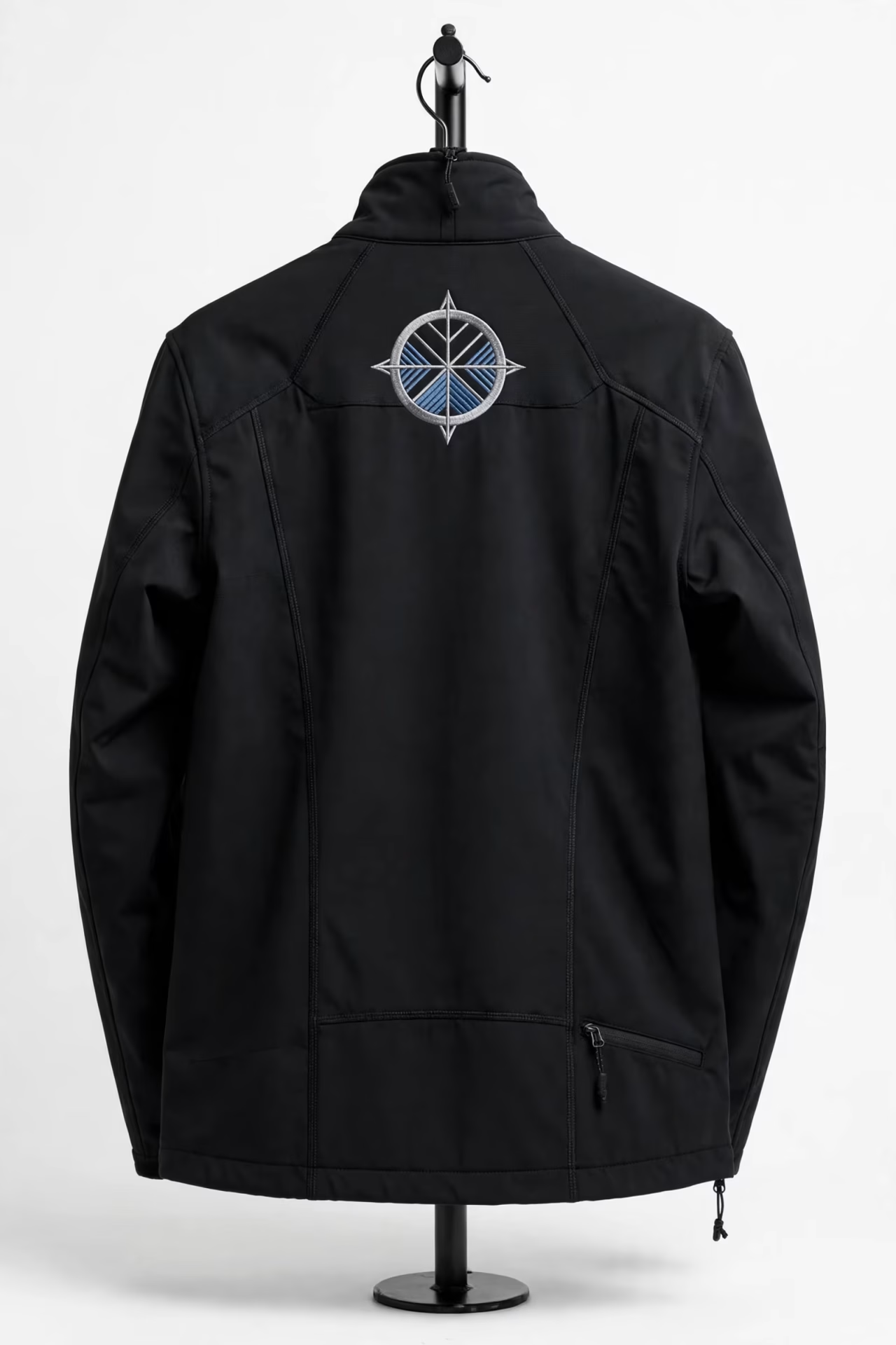
Jackets combine the chest positions of shirts with the one placement no other common garment offers at scale: the full back. Back designs are centred between the shoulder blades, sized generously but drawn openly, with the garment colour carrying part of the design so the piece stays wearable and the stitch count stays sane. The back is where a brand speaks loudly, and its placement is checked on a worn jacket, because backs curve and a design centred on the table can ride high or low on the body.
Technical jackets add fences of their own: waterproof membranes that needle holes compromise, bonded seams, zips and storm flaps that cross classic positions. Placement on a softshell is negotiated with the garment’s construction first, decoration second, sometimes moving a chest logo a centimetre for a seam, sometimes choosing a sleeve or a below-zip position. The map is the same; the terrain decides the exact ground, and the sample is approved on the production style for that reason.
Names and Personalisation: The Second Line of the Map
Personalised programs add names to the map, most often on the right chest opposite the logo, set on the same baseline so the pair reads level across the garment. Names bring their own placement problems: lengths vary wildly, and a position centred for a short name drifts for a long one, so the specification fixes an anchor, usually the starting edge, and lets the name grow from it rather than re-centring every garment into a wandering line.
The same discipline governs names on backs, caps and workwear thigh positions: one anchor rule, one size, one font cut, applied without exception. Personalisation looks chaotic exactly when each garment was placed by judgement; it looks like a system when the map was fixed first. Buyers approving a personalised program should approve two samples, the shortest and the longest name on their list, because those two define the territory every other name will occupy.
Measuring Placement: How Factories Keep It Consistent
Consistency comes from measurement systems, not from good eyes: placement templates and marked hooping stations that put every garment in the run at the same coordinates, checked against a specification that names distances from seams and edges rather than descriptions like “upper chest”. First-off garments are measured against the spec before the run proceeds, and the tolerance is agreed in advance, because hand hooping is human work and a millimetre standard honestly kept beats a perfect standard claimed.
Buyers can audit this cheaply: take three garments from different cartons, lay them together and compare logo positions. A program under control shows near-identical placement; a drifting one tells its story in centimetres. Ask for the placement specification with the sample approval, positions and sizes per garment, and keep it with the thread list and the sew-out as the program’s three governing documents.
Placement Mistakes That Reach the Buyer
The failures that arrive in cartons are rarely exotic. A logo placed for the sample size and never adjusted rides high on small sizes and low on large ones. A chest mark set by eye sits a centimetre different on every garment, invisible singly and obvious the moment a team stands in a row. A cap design centred on the panel instead of the wearer’s view tilts in wear. A back design centred on the table sits crooked on the body because backs are not tables.
Every one of these is a specification failure, not a sewing failure, and each is prevented by the same dull instruments: measured positions, anchor rules, first-off checks and samples approved worn. Programs learn this once, expensively, or adopt it from the start at the price of one careful sampling round. The placement map is cheap paper; the lesson it prevents is priced per carton.
Size by Position: The Working Ranges
Each position has a natural size band set by anatomy and construction. Chest marks live in the modest band that conversation reads; cap fronts are governed by panel height; sleeve marks by the arm’s width; jacket backs by the span between the blades. Working inside the bands looks effortless; exceeding them by a little costs legibility, wearability or both, and exceeding them by a lot produces garments whose logos arrive before their wearers do.
When a brief demands bigger, the honest answers are a different position or a different process: the back instead of the chest, print instead of thread. Placement and size are one decision, and programs make it once, at artwork stage, with the map in view. Our programs run at our standard minimum of 1,200 pieces per style in up to two colours, with each position digitized for its own garment, because a placement map honoured in the file is honoured on every chest that follows.
Approving Placement at the Sampling Stage
Placement approval deserves the same formality as colour approval: the sample worn or on a stand, photographed straight, measured against the specification, and signed with the numbers recorded. A sample approved flat on a table approves a geometry the body will not keep; a sample approved in wear, at the distances the garment will be seen, settles questions that cartons cannot reopen. Keep the approved positions with sizes per garment in the program record, beside the sew-out and the thread list.
Repeats then become verification rather than renegotiation: the first-off garment of each run is measured against the record before the batch proceeds, and any new style joining the program gets its positions mapped and approved before its first order, not discovered during it. Placement, treated as documentation, stops being a recurring conversation and becomes what it should have been all along, a settled fact of the program.
Frequently Asked Questions
Where exactly does a left chest logo sit?
On the wearer’s left chest, centred on the chest panel at measured distances from the shoulder seam and centre front given in the placement specification, clear of placket, pocket and armhole. It is sized to the smallest garment in the size range so it sits correctly on every size, and checked on a first-off garment before the run.
Can the same design file serve every position?
No. Each position is digitized for its own dimensions, fabric and constraints: caps for their curve and seam, sleeves for the arm, backs for scale with open design. Scaling one file everywhere produces the classic failures, overflow on caps, crowding on chests, distortion on light fabrics, that per-position files exist to prevent.
How large can a jacket back embroidery be?
As large as the back panel and sensible stitch economics allow, provided the design is drawn openly, with garment colour carrying part of the artwork, and checked centred on a worn jacket. Very dense full-coverage backs grow heavy and costly; open, well-placed designs read bigger than they measure.
How do I check placement consistency in a delivered order?
Lay three garments from different cartons together and compare logo positions and heights; a controlled program shows near-identical results within the agreed tolerance. Keep the placement specification from sampling, and judge deliveries against it rather than against memory or photographs.