
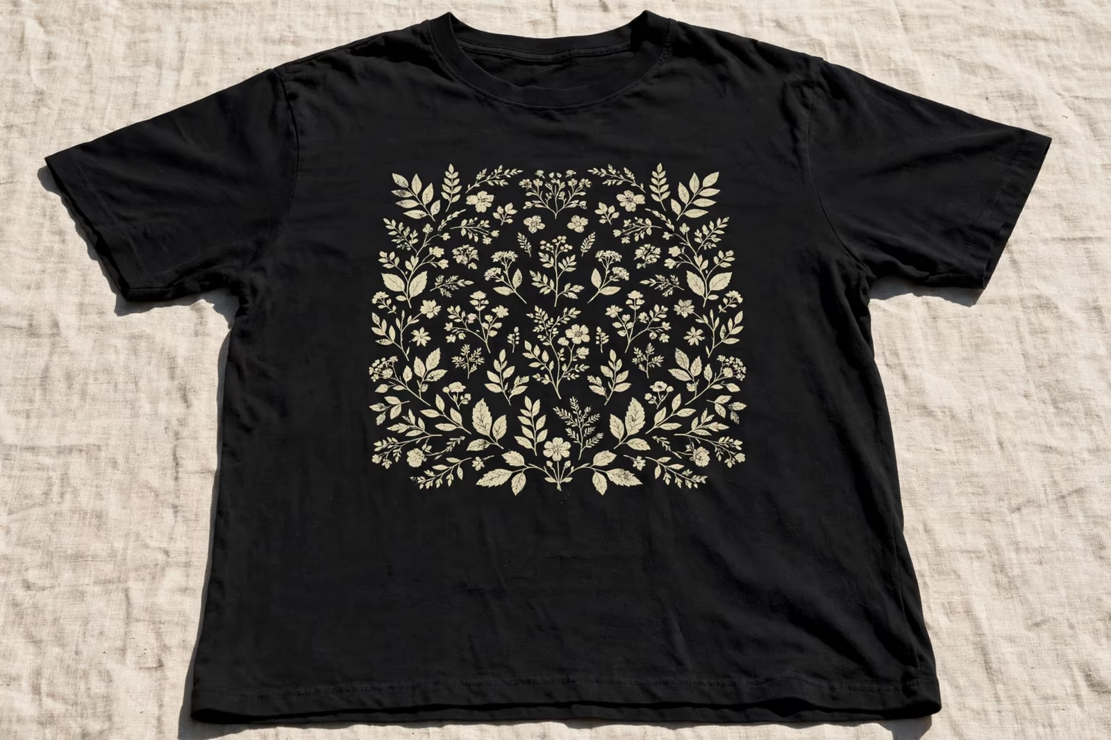
Run your hand over a printed black t-shirt from a good vintage program and something feels impossible: the design is bright, detailed, and completely absent to the touch, as if the shirt had been woven with the picture already inside it. That trick is discharge printing, the process that removes a dark garment’s dye and replaces it with pigment in a single pass, producing the softest prints in the screen printing trade and a few constraints every buyer should understand before specifying it.
Discharge printing is run in Bangladesh for buyers in the USA, the UK and Australia, where dark garments are printed without a heavy ink film sitting on the fabric.
This guide explains discharge inside our screen printing work, on garments such as the premium heavyweight t-shirt, and how it sits among the decoration routes our brands choose for dark garments.
What Discharge Printing Actually Does
Standard printing adds colour on top of fabric. Discharge printing subtracts first: the ink carries an activator that, under heat, breaks down the garment’s dye in the printed area, stripping the colour out, while pigment in the same ink deposits into the cleared fibres. The result is a print that lives inside the fabric rather than on its surface, with a hand feel printers call zero hand: nothing to find with your fingertips at all.
The effect is most dramatic on dark garments, where a conventional print needs a heavy underbase and still feels like a coating, while a discharge print reads bright and breathes like the shirt itself. It is the standard route for vintage, music merch and premium fashion work on darks, anywhere the print should feel inherited by the garment rather than applied to it.
The Chemistry in Plain Language
Discharge ink is a water-based system with two working parts: the pigment that supplies the new colour, and the activator, a reducing agent, mixed in shortly before printing because its strength fades once activated. The ink prints like any water-based ink; the chemistry wakes up in the dryer, where heat triggers the activator to bleach the dye while the binder fixes the pigment.
Two practical consequences follow. The ink has a working life measured in hours once activated, so batches are mixed for the run, not the week. And the process needs proper ventilation and handling discipline in the print room, because the activation releases fumes that responsible factories manage with extraction as a matter of routine. Neither point should worry a buyer; both should reassure you that the factory runs the process professionally.
Which Garments and Dyes Discharge Properly
Discharge works on reactive-dyed cotton, and the garment’s dye is the process’s raw material. Most black, navy and deep-coloured cotton garments discharge beautifully to a soft off-white base that pigment then colours. But not every dye discharges: some colours, certain greens, royal blues, purples and teals among them, resist or shift unpredictably, and synthetic dyes on polyester do not discharge at all.
This is why discharge programs are built garment-first. The factory tests the actual garment, from the actual dye lot, before quoting brightness, because the base the dye releases to decides what colours are achievable on top of it. A brand that wants discharge on a new garment colour should expect, and welcome, a discharge test panel in sampling; a factory that promises results on an untested garment is guessing with the buyer’s money.
Colour Behaviour: Bright, Soft and Slightly Unpredictable
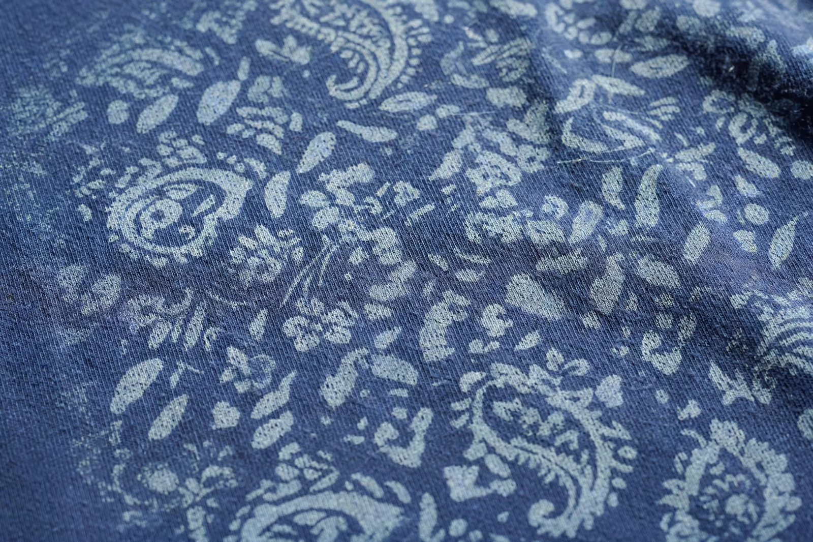
Discharge colour is honest but not literal. Because the pigment sits in cleared fibre rather than on an opaque base, colours print with a slightly vintage softness, and the cleared base is a natural off-white rather than a paper white, so the same formula reads marginally warmer than its plastisol twin. Pantone matching is achievable within a wider tolerance than on an underbase, and approvals must be judged discharged, cured and washed, on the real garment.
White discharge, printed with no pigment, gives the classic natural look: the design in the garment’s own cleared fibre tone. Fluorescent and very bright saturated shades need specialty discharge formulations and testing. None of this is weakness; it is the aesthetic the process is bought for. Buyers who want billboard opacity should choose an underbased print, and buyers who want the softest possible dark-garment print should accept discharge’s gentle colour character as the price of zero hand.
Discharge Versus Water-Based and Plastisol on Dark Garments
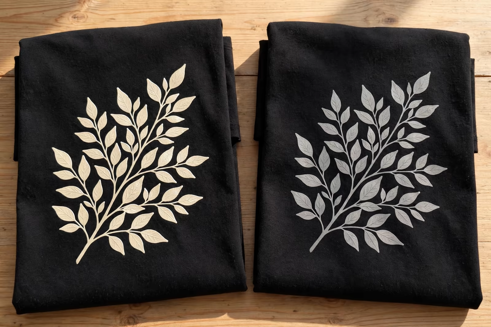
Three routes compete for dark garments, and each wins somewhere. Standard water-based ink on darks struggles for opacity and needs high-opacity formulations and multiple hits, landing soft but rarely bright. Plastisol over a white underbase wins outright on opacity, colour accuracy and consistency, and loses on hand feel and breathability, especially over large areas. Discharge wins on feel absolutely, breathes perfectly, and accepts its colour tolerances and garment limits as the trade.
Hybrid work borrows from both: a discharge underbase, cleared and soft, with plastisol colours printed on top for accuracy, giving brightness with a fraction of the usual hand. Experienced buyers specify by priority: if the customer must not feel the print, discharge; if the brand colour must be exact at distance, underbase; if both matter, hybrid, sampled properly and priced for its extra pass.
Durability, Washing and the First-Wash Effect
A discharged print cannot crack or peel, because there is no film to fail; its durability story is colour rather than structure. The print often brightens slightly after the first wash, as loose surface pigment and residual dye wash away and the true discharged colour settles, which is why approvals judged before washing can mislead by a half-shade of optimism.
Across the garment’s life the print fades exactly as the garment fades, gracefully and together, one more reason vintage programs love it. The process does slightly weaken fibres in the printed area compared with unprinted cloth, an effect that is negligible on quality garments and one more reason discharge belongs on decent fabric, not on the cheapest tee in the catalogue. Care is ordinary: wash inside out, and the print will age like the shirt it has become part of. Buyers comparing samples should always wash the discharge sample before judging it, since the settled colour is the true one.
Artwork and Design Considerations for Discharge
Discharge rewards designs drawn for it. Fine detail holds beautifully because there is no ink film to fill gaps, halftones print with a softness other processes envy, and large solid areas, the weakness of underbased printing, are discharge’s home ground since a solid area of zero hand feels like nothing at all. Photographic and distressed artwork looks native here; the process forgives, and even flatters, imperfection designed into the art.
Designers should still supply vector artwork with colours specified, and should think in terms of the cleared base: subtle tonal differences in the original art survive, while colours that depend on a pure white ground for their brightness will land warmer. A separator experienced in discharge adjusts expectations at the film stage, where adjustments are free.
Formaldehyde-Free Discharge and Compliance
Classic discharge activators are based on zinc formaldehyde sulfoxylate, and the name alone explains why compliance teams ask questions. The formaldehyde is consumed in the reaction and the finished, washed garment carries no meaningful residue, but brands supplying strict markets and retailers with chemical policies often specify formaldehyde-free discharge systems, which use alternative reducing chemistry to achieve the same dye removal.
These newer systems discharge slightly less aggressively and can cost more, and their colour behaviour needs its own sampling, but they are production-proven and increasingly standard for European and North American programs. The buyer’s job is simple: state the chemical standard the program must meet in the specification, and let the factory select and sample the compliant system, rather than discovering the requirement at testing, where a finished bulk can fail a paperwork exam its printing passed beautifully.
Process Control: Where Discharge Runs Are Won
Discharge printing concentrates its risk in three controls. The first is the mix: activator percentage and freshness decide the strength of the discharge, and ink mixed yesterday will print weaker today, so batches are weighed, timed and discarded on schedule rather than topped up hopefully. The second is the dryer: the garment must reach full activation temperature through the print, and a cold dryer produces the process’s signature failure, a print that looks dull and patchy where the dye only half-released.
The third control is the garment itself, arriving from dye lots that vary enough to matter. Print rooms running discharge seriously pull and test garments from each new lot before the run, adjusting nothing if the release is clean and raising a flag before bulk if it is not. Buyers see none of this discipline in the finished shirt, which is precisely its point: a perfect discharge print hides every decision that made it, and only its softness testifies.
Specifying Discharge Printing in a Program
Specify discharge by name, on a named garment whose dye has been test-discharged, with colour approved on a washed production-fabric sample under standard light. Quantities follow our standard minimum of 1,200 pieces per style in up to two colours, with discharge counted as the print system for the design.
Build the garment test into the calendar before bulk, keep the approved washed sample as the standard, and discharge will deliver the thing no other process can: a dark garment whose print you can see clearly and feel not at all. For premium dark programs, that combination is not a novelty; it is the entire point of the product.
Frequently Asked Questions
Why does a discharge print feel like nothing on the shirt?
Because it adds no surface film. The process removes the garment’s dye in the printed area and deposits pigment into the cleared fibres, so the design lives inside the fabric itself. Your hand feels only cotton, which is why printers call the result zero hand and why vintage and premium programs specify it.
Can discharge printing be done on any dark garment?
No. It needs reactive-dyed natural fibre, cotton above all, and even then some dye colours resist discharging or shift unpredictably, including certain greens, purples and royal blues. Polyester does not discharge. The garment and dye lot must be test-discharged before brightness is promised, which is why sampling includes a discharge test panel.
Are discharge colours as bright as plastisol prints?
They are bright in a softer register. Discharge colour sits in cleared fibre over a natural off-white base, so it reads slightly warmer and more vintage than an opaque plastisol print on a white underbase. For exact, billboard colour, underbase printing wins; for feel, discharge wins. Hybrid printing splits the difference.
Does discharge printing weaken the garment?
The chemistry slightly reduces fibre strength in the printed area compared with unprinted cloth, an effect that is negligible on good-quality cotton garments and one reason discharge is specified on decent fabric. The print itself cannot crack or peel, since there is no film, and it fades gracefully together with the garment.