
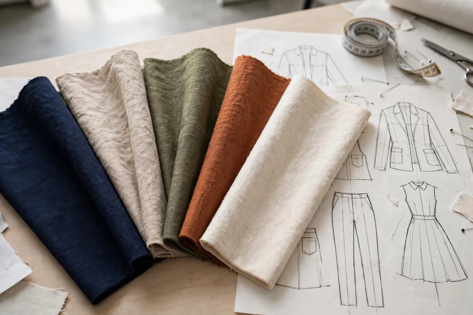
A colour story is the palette a collection wears, and planning one is where design instinct meets dye-house arithmetic. Every colour in a range is a fabric lot, a dyeing, a set of matched trims and threads, and each lot carries a minimum the mill will not go below. A brand that plans its palette as pure aesthetics discovers the arithmetic at the fabric order, when a beautiful fifth colour turns out to be an inefficient fragment of a production run. A brand that plans colour as both story and structure gets a range that looks intentional and produces cleanly. This guide shows how the two are planned together, by sharing dye lots across styles instead of fighting them style by style.
Colour stories planned with us in Bangladesh end up on rails in the Middle East, the UK and Australia, and the dye lots behind each palette have to satisfy all of those markets at once.
Colour planning sits inside our brands programs, works with pieces like our pullover hoodie, and follows the discipline of our MOQ and production framework.
The Dye Lot: The Unit Colour Is Really Bought In
Colour is not purchased by the garment or the metre in the abstract; it is produced in lots. A dye house loads a vessel, runs a recipe to a shade standard, and the lot that emerges shares one exact colour life: pieces cut from it match each other, and pieces from the next lot, however carefully matched, are cousins rather than twins. Minimums attach to the lot, because the vessel, the recipe work and the quality checking cost what they cost regardless of how little fabric swims in them.
Every planning decision in this guide flows from that single fact. A colourway in one style consumes part of a lot; the same colourway across three styles consumes the lot properly. Shade continuity within a garment and across a delivery depends on lot discipline, and the brand’s palette is, in production terms, a list of lots it has committed to fill.
Sharing Lots Across Styles: The Core Technique
The technique is simple to state: choose the season’s core colours, then run those same colours across multiple styles and fabric families where the design allows, so each dye lot serves several styles at once. A navy that appears in the hoodie, the tee and the jogger is one strong lot with three customers inside the range, instead of three weak lots pretending to be different decisions. The palette gains coherence as a side effect: the range photographs as a family because, materially, it is one.
Sharing works across fabric types with one discipline: the shade standard is approved per fabric, because the same recipe reads differently on cotton jersey, fleece and rib. Lab dips are approved fabric by fabric against the standard, and the lot is only shared in the planning sense; each fabric still dyes in its own vessel, matched to the same approved standard, which is what makes cross-style coordination safe rather than hopeful.
Building the Palette: Core, Accent and Test Colours
Professional palettes are built in tiers. Core colours carry the volume: proven, wearable shades, shared widely across styles, renewed each season. Accent colours carry the story: fewer styles, chosen impact, the shades the campaign photographs lead with. Test colours carry the learning: one style, one colourway, a deliberate experiment whose result decides next season’s cores. The tiers let a brand be brave and efficient simultaneously, because bravery is concentrated where its cost is smallest.
The tiering also disciplines reordering. Cores reorder with confidence and fabric continuity; accents reorder while the story is alive; tests either graduate or retire on evidence. A palette without tiers treats every colour as equally important, which in production means every colour is equally fragmented, and the dye lots tell the tale in surcharges and shade arguments.
Black, White and the Neutral Problem
Neutrals look like the easy part of a palette and behave like its trap. Black is not one colour in production: rich black, soft black and blue-black are different recipes with different fade characters, and a range that mixes them reads as a mistake under shop light. White is worse: optical whites, natural whites and cream-leaning whites clash visibly when garments hang together, and white lots pick up shade differences from water and finishing that coloured lots forgive.
The planning answer is to treat neutrals as colours in their own right: one black standard, one white standard, approved per fabric like any fashion shade, held across styles and seasons with the same discipline. The rail’s calm, coherent neutral block, the part customers trust most, is manufactured out of exactly that unglamorous consistency.
Shade Standards and Lab Dips: Agreeing the Colour
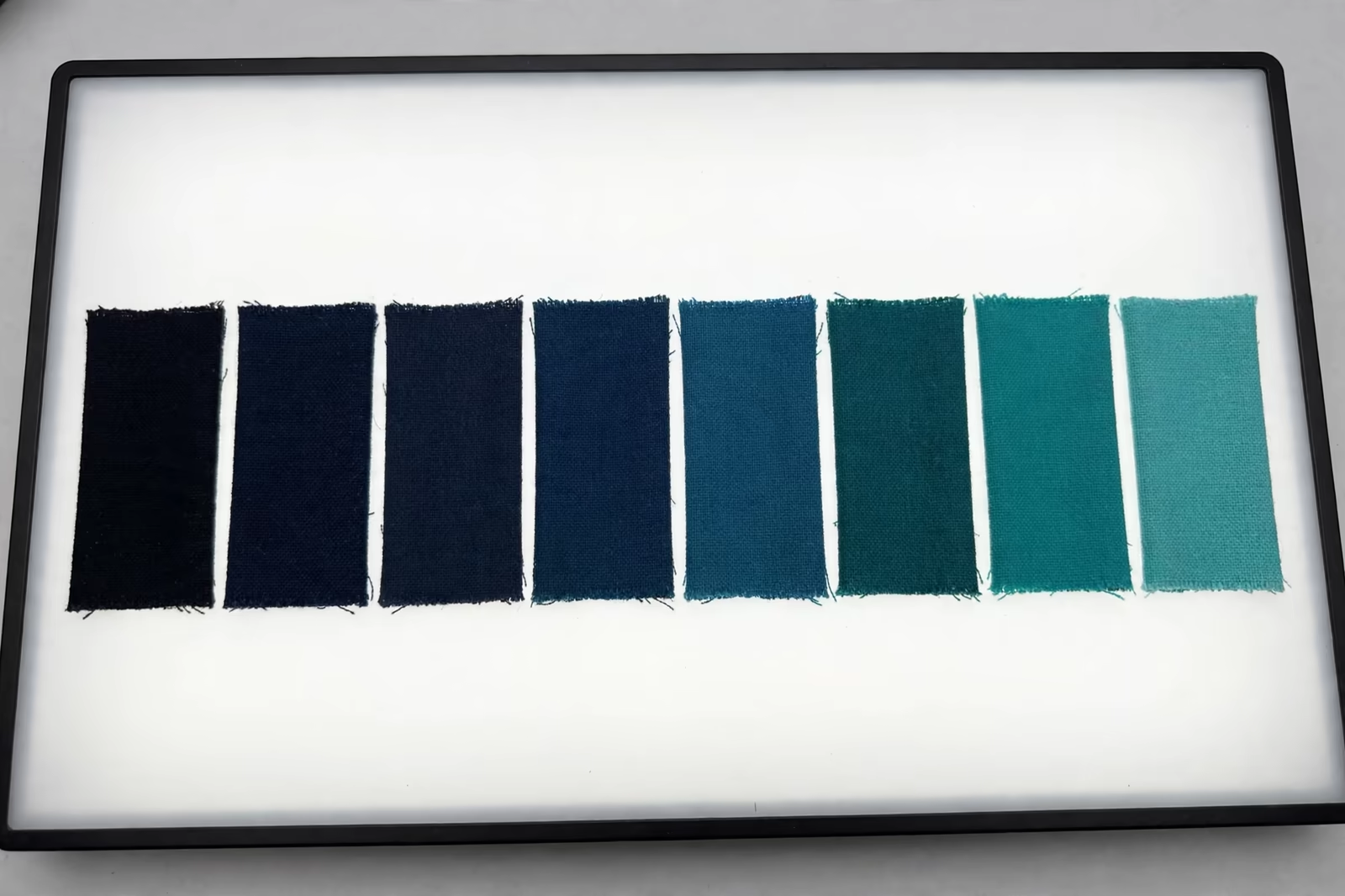
A shared lot strategy stands on agreed colour. The brand supplies the standard, a physical swatch or a recognised colour reference, and approves lab dips, small dyeings on the actual fabric, under standard light, before any bulk lot is committed. Approving from a screen or a paper chip is how ranges acquire a navy that is three navies; approving dipped fabric, fabric by fabric, is how a colour story survives contact with five different cloths.
The approved dips join the style files as the shade’s legal record, and bulk lots are judged against them under the same light discipline. Colour arguments in production are almost never about eyesight; they are about which standard, approved when, on which fabric, and the file answers before the argument starts.
Seasonal Drops Without Lot Chaos
Brands increasingly sell in drops, and colour stories must survive the calendar. The method is to separate the permanent palette, the cores that run all year, from the seasonal layer that rotates: drop colours are introduced on limited styles, in quantities planned against their own lots from the start, so a capsule refresh does not fragment the core production it lands beside. The drop gets its excitement; the cores keep their depth; the dye house sees a plan instead of a series of surprises.
Drops also benefit from the shared-lot habit in reverse: a drop colour that proves itself graduates into the core palette at season change, carrying its approvals and trim specifications with it, while a drop colour that fades retires cleanly because it was never allowed to sprawl across the whole range.
Trims, Threads and Prints in the Same Colour Logic
A colourway is more than its shell fabric: sewing threads, drawcords, zips, ribbing, elastic and prints must all arrive at the same colour decision. Dyed-to-match trims have their own minimums and lead times, and a palette planned without them discovers at the sewing stage that the fabric is ready and the matching rib is not. Sharing colours across styles pools the trims too, one thread and cord specification serving the whole story, bought once at sensible quantities.
Prints obey the same economics in reverse: a graphic’s ink colours are cheap to share across styles and colourways, which is why experienced brands let print palettes wander less than garment palettes. A print designed on the core colours prints cleanly on every base in the story; a print demanding a special base colour invents a dye lot for decoration’s sake.
Colour Names, Codes and Records
A colour story lives or dies by its records. Every palette colour carries a code and a name used identically on tech packs, fabric orders, trim orders and packing documents, because a dye house cannot match an adjective. The file for each colour holds its standard reference, per-fabric approved dips, recipe notes where the dye house shares them, and the styles and seasons it served, so continuity is checked against paper rather than memory.
Renaming discipline matters at reorder: a shade may be marketed under a fresh name while its production code, recipe and standard stay constant underneath, giving the customer novelty and the factory continuity at the same time. Confusing the two layers, changing the recipe when only the name changed, is how trusted colours quietly become strangers.
Planning the Range on Paper: The Colour Matrix
The working tool is the colour matrix: styles down one side, colours across the top, cells marked where a style is offered in a colour, with quantities roughed in. The matrix makes lot-sharing visible at a glance. A colour column thinly scattered across single styles is a fragmentation warning; a colour carried by several styles at healthy depth is a lot that will dye cleanly and cheaply. Founders who build the matrix before sampling find their palette editing itself, as weak columns ask to be merged, deepened or dropped.
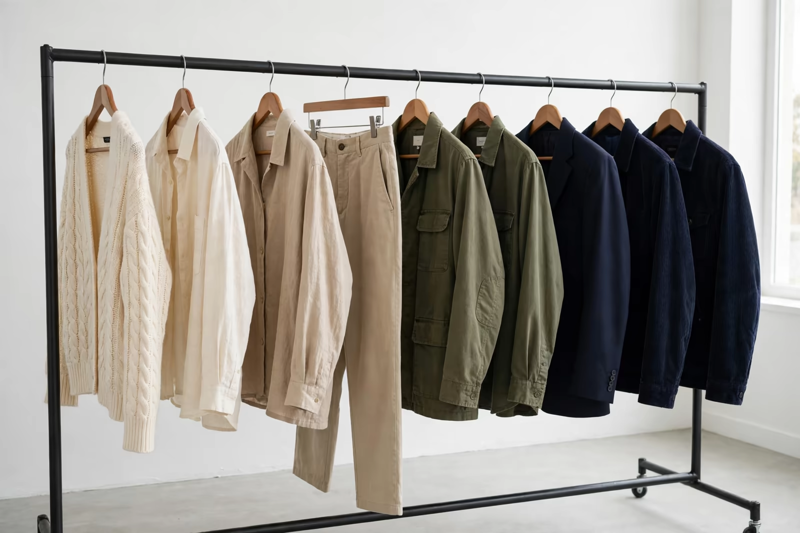
The matrix also protects the story’s balance: it shows whether the rail will hang as a coherent gradient or a shout of unrelated shades, whether the darks and lights are distributed across categories, and whether the photographer’s hero colour actually exists in the styles the campaign needs. It is ten minutes of grid that prevents a season of improvisation.
Reorders and Continuity: The Second-Season Dividend
Shared lots pay their largest dividend at reorder. A core colour reordered across styles refills one lot relationship with the dye house, its recipe and approvals already proven; shade drift is checked against retained standards from the first run; trims repeat without new setups. The brand’s second season in a core colour is faster, more consistent and cheaper to execute than its first, which is the arithmetic form of brand equity: customers meet the same navy, season after season, and learn to trust it.
Our programs run at a standard minimum of 1,200 pieces per style in up to two colours, and colour stories are how that discipline becomes an asset rather than a limit: two colours per style, chosen from a shared palette, deliver depth in every lot and breadth across the rail at the same time.
Frequently Asked Questions
Does sharing colours across styles make my range look repetitive?
It makes it look related, which is what a collection is. Repetition is avoided by design, different silhouettes, fabrics, textures, graphics and styling on the shared palette, the way established brands build recognisable rails. A customer should be able to mix the range’s pieces without a colour argument; that harmony is the shared palette working, and it photographs, merchandises and reorders better than a rail of strangers.
Can the same colour name cover different fabrics?
Yes, with per-fabric approval: each fabric’s lab dip is approved against the master standard under standard light, because dye recipes and base cloths shift the reading. The name is one, the recipes are several, and the file holds each fabric’s approved dip as the reference its bulk lot is judged against. Skipping the per-fabric dip is how one colour becomes three.
How many colours should a first collection carry?
Enough to tell the story and no more: typically a small set of core colours shared across the styles, plus one or two accents placed deliberately. Every additional colour is another set of lots, trims and minimums competing for the same budget, so colours earn their place by the styles they can carry. Season two, funded by evidence, is where palettes safely grow.
What happens when a colour sells out faster than the others?
Reorder the winner while its lot story is warm: recipe, approvals and trim specs are all on file, and the shared-lot structure means the colour often re-enters production alongside other styles using it. The matrix from planning season shows at a glance which styles can carry the reorder deepest, so the fast colour returns where it will sell, not merely where it started.