
A cap is the smallest billboard a brand owns and the least forgiving one to embroider. The front panel is curved, structured, seamed down the middle and shallow, yet buyers arrive with logos drawn for flat, generous surfaces and expectations set by photographs of other people’s caps. Cap embroidery rewards the designs that respect its territory and punishes the rest politely but permanently, in puckers, in drifting seams, in text that reads like an apology. This guide sets out what goes where on a cap, front, side and back, and the limits that no machine setting can negotiate away.
The caps stitched for these placements are embroidered in Bangladesh for teamwear and merchandise buyers in the USA and the UK, and every limit in this guide is one their orders run into.
It draws on the cap programs we run alongside our main embroidery work, most of them built on the classic baseball cap, and it ends where every cap order should start, at the quote stage, with artwork already shaped for the cap it will live on.
The Front Panel: Prime Territory, Strict Borders
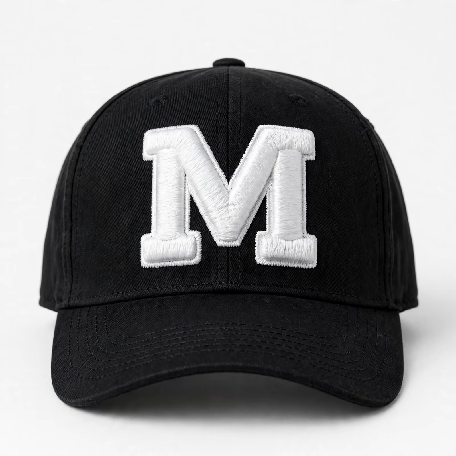
The front of a structured six-panel cap offers the best embroidery real estate on any headwear: two panels stiffened by buckram, holding a design flatter than the cap’s curve suggests. Its borders are set by construction, not taste. Height is the hard limit: the panel from brim seam to crown offers roughly five to six centimetres of honest sewing height, and designs that ask for more will climb the curve toward the crown, where stitches distort, or crowd the brim seam, where the machine cannot follow.
Width is more generous, spreading across both front panels, but the centre seam runs through everything, and fine detail parked exactly on that seam will shift and open as the seam’s ridge takes the thread unevenly. Experienced digitizers draw front designs seam-aware, keeping critical detail off the centre line or bold enough to stride across it, and the sampling conversation for any new cap starts with those two numbers, height and the seam, before a single colour is discussed.
3D Puff: The Front’s Signature Effect
Puff embroidery, foam under the stitch raising the design into a bold relief, belongs to the front panel the way foil belongs to a book cover. It needs what the front has: big, simple shapes with rounded corners, letters drawn fat and open, no detail finer than the foam can lift. A puff design is redrawn, not converted; the flat logo’s thin lines and small text are removed or rebuilt at sampling, which surprises buyers who expected a setting rather than a redesign.
Puff also narrows the colour story, because the raised satin edge that seals the foam reads as part of the design and is usually matched to the fill. Programs choose puff for the marks that can survive simplification, sports and streetwear marks mostly, and the result, a logo you can read by touch, earns its place as the front panel’s signature. What puff cannot do is share the front with fine detail beneath it; the territory holds one idea at a time.
Side Placements: The Discreet Second Mark
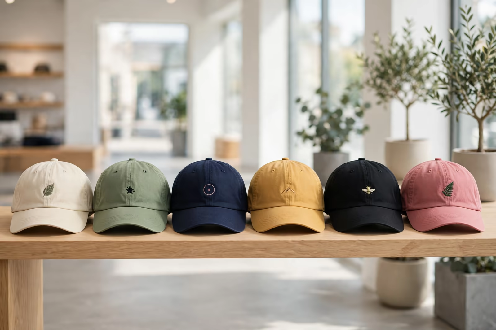
The side panels take the small stuff: a secondary mark, a flag, a sponsor’s minor logo, initials, a website line in the smallest honest type. The territory is tighter than it looks, because the panel narrows toward the back and the eyelet and seams fence it in, so side designs live small, typically a few centimetres wide, and simple, one or two colours, shapes that survive being read at an angle on a moving head.
Left side or right is a specification, not a default, and it should be written down, because wearers and photographs disagree about which side shows. Programs with marks on both sides settle the hierarchy once, primary front, secondary on the wearer’s left, detail on the right, and hold it across every reorder, since a fleet photographed together betrays any drift instantly. Side placement on unstructured caps needs a steadier hand and looser expectations; the soft panel moves, and the sewing shows it.
The Back: Closures, Arches and Keyholes
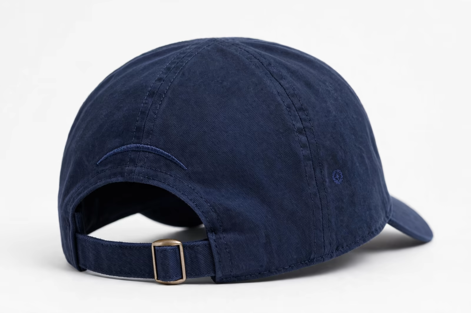
The back of the cap is defined by its closure. Above a snapback or strap opening, the classic placement is a small arch of text or a compact mark riding the curve over the opening, lettering drawn to the arch’s radius so it sits parallel to the edge rather than fighting it. The territory is shallow, a centimetre or two of height, which makes back lettering a test of the small-text rules: bold, simple, short.
Closed-back fitted caps offer a fuller rear panel and take a centred small design instead, while caps with mesh backs take almost nothing gracefully, the holes of the mesh interrupting stitches and the panel too soft to hold registration. The honest specification for mesh-back truckers puts everything on the front and lets the back stay clean. Buyers should also know the back mark’s audience: it is the one read by the person behind, in queues and crowds, which makes it the natural home of the short message, the hashtag’s stitched ancestor.
Height, Width and the Numbers That Govern
Every cap placement reduces to measurements the buyer can hold a factory to. Front: height capped by the panel, commonly around five to six centimetres at the very most, width spreading wider but seam-aware. Sides: a few centimetres each way, fitted between seams and eyelet. Back arch: a shallow band above the closure. These are not house preferences; they are the geometry of a sewn object, and a design that exceeds them is not being embroidered badly, it is being asked to exist where the cap is not.
Sampling turns the numbers into evidence: the design sewn on the actual cap style, at bulk colours, photographed straight and at the angles people actually see caps. Approve the sample against the worst case, the smallest text at the greatest curve, because bulk will reproduce the sample, not the artwork. Programs that keep their approved cap samples on file, tagged with placement measurements, reorder for years without re-arguing geometry.
Seams, Eyelets and Panels: Designing Around Construction
A cap is not a blank curved sheet; it is six panels sewn together, with a button on top, eyelets in the panels and a sweatband inside, and embroidery must thread its way around that architecture. The centre front seam we have met. Eyelets sit where side designs want to spread, and a stitch field that swallows an eyelet will pucker around it. The button crowns the cap above the front design’s ceiling, another reason height stays honest.
Structured and Unstructured Panels
Panels also differ in stiffness across cap styles: structured fronts hold a design’s registration crisply, unstructured fronts and dad caps let fabric breathe and shift, rewarding softer, lighter designs. The pattern repeats across this whole guide: the cap’s construction is a co-designer of every logo placed on it, and the programs that flourish are the ones that invite it into the conversation at artwork stage rather than meeting it at the machine.
Under the Brim and Other Special Placements
The brim itself takes embroidery badly: it is stiff, layered and curved in two directions, and most programs leave it alone. The exception that works is the under-brim on caps whose underside is a fashion surface, a contrasting colour carrying a small mark or word, read only when the cap tips. Sandwich brims, with their contrast edge layer, offer branding by construction instead of by stitch, a reminder that not every brand moment on a cap needs thread.
Strap and closure placements exist too, tiny marks on the adjustment strap, and they obey the smallest scale of all: one simple shape, one colour, sampled with suspicion. The general discipline is that special placements are garnish. The front carries the brand, the sides support it, the back signs it; a cap that tries to speak from every panel at once ends up saying nothing from any of them.
What Cannot Be Embroidered on a Cap
The refusal list is short and physical. Photographs and gradients cannot stitch, on caps or anywhere else, and on a cap’s small territory they cannot even pretend. Fine text below the legibility floor fails faster on the curved panel than on flat garments. Designs taller than the front panel cannot be persuaded by hooping tricks. Metallic thread on high-flex zones cracks its sheen early. And all-over, seam-to-seam coverage belongs to cut-and-sew construction, decoration applied to panels before the cap exists, a different product conversation entirely.
Each refusal has a redesign behind it: the photograph becomes a simplified mark, the gradient becomes two flat colours, the tall logo loses its tagline to the side panel, the all-over ambition becomes a woven label or a printed under-brim. A good cap program is mostly this translation work, and it happens before the quote hardens, which is why artwork shaped for caps gets honest prices and artwork shaped for billboards gets apologies later.
Ordering Caps: The Specification That Prevents Surprises
A cap order that runs smoothly carries a short, complete specification: cap style and structure, front design with its height stated, puff or flat, side and back placements named with their sides, thread colours per garment colour, and the sample approval tied to the actual cap. Our own programs run at our standard minimum of 1,200 pieces per style in up to two colours, caps included in the ranges they share factories with, and the specification habit matters more as quantities grow, because a placement error replicates exactly as faithfully as a correct one.
Bring the artwork early and let it be reshaped; that is the whole secret. The cap will impose its geometry either at the drawing board, where changes are free, or at the machine, where they are not. Choose the drawing board, approve the sewn sample on the real cap, and the smallest billboard you own will work as hard as the biggest one.
Frequently Asked Questions
How big can a front-of-cap logo be?
Height is the binding limit: the front panel offers roughly five to six centimetres of honest sewing height between the brim seam and the crown curve, and designs taller than that distort as they climb. Width can spread across both front panels, provided critical detail respects the centre seam. State the height in the order specification and approve it on a sewn sample.
What is 3D puff embroidery and does my logo suit it?
Puff places foam under the stitches so the design stands in bold relief. It suits big, simple shapes and fat, open lettering; fine lines, small text and detail are removed or rebuilt when a logo is redrawn for puff. If your mark survives simplification, puff gives the front panel its most distinctive finish; if it does not, flat embroidery is the honest choice.
Can we embroider on the back and sides too?
Yes, within their territories: small secondary marks on the side panels, kept clear of eyelets and seams, and a compact mark or short arched line above the back closure. Closed-back caps take a small centred rear design; mesh backs take almost nothing well. Settle which side carries what in the specification, and hold it across reorders.
Can a detailed or photographic logo go on a cap?
Not as it stands. Thread cannot render photographs or gradients, and the cap’s small, curved territory shrinks detail further. The design must be simplified into bold shapes and flat colours, fine text moved or enlarged past the legibility floor. That translation happens at artwork stage, and a sewn sample on the actual cap proves the result before bulk.